Growth Design- AirBrush
Project Timeline
May 2019 - Jan. 2021
My Role
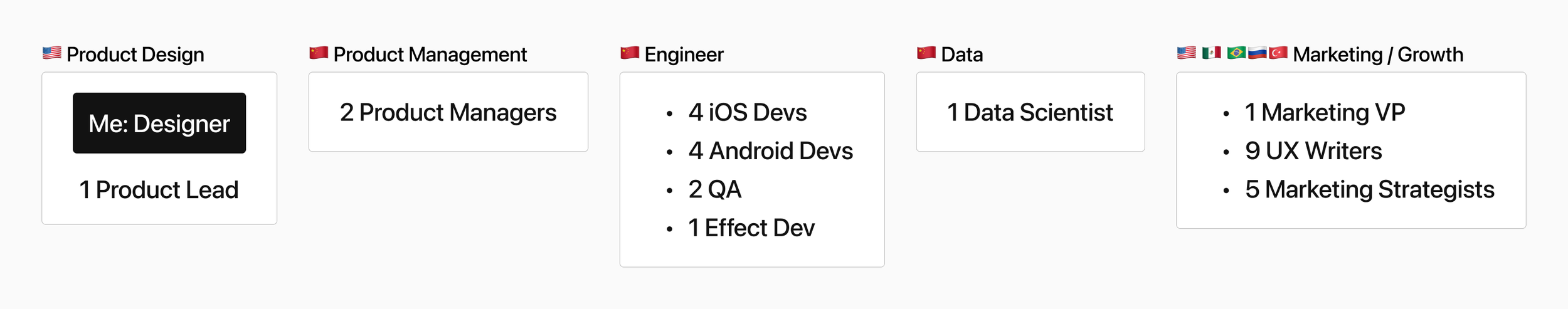
As the only Product Designer on the AirBrush team of 31, I was responsible for end-to-end product development:
Product strategy, user research, A/B test design, interaction design, motion design, and visual design (layout, icons, illustrations, video production).
Stakeholders
Background
Meitu, a Chinese company specializing in photo/video apps, invested into the US market by developing AirBrush, centered on the Western customer. When I joined the AirBrush team in 2019, the product was struggling financially. As the only product designer on the team, I drove AirBrush’s revenue growth with PMs and marketing specialists by designing a variety of A/B tests and photo editing features.
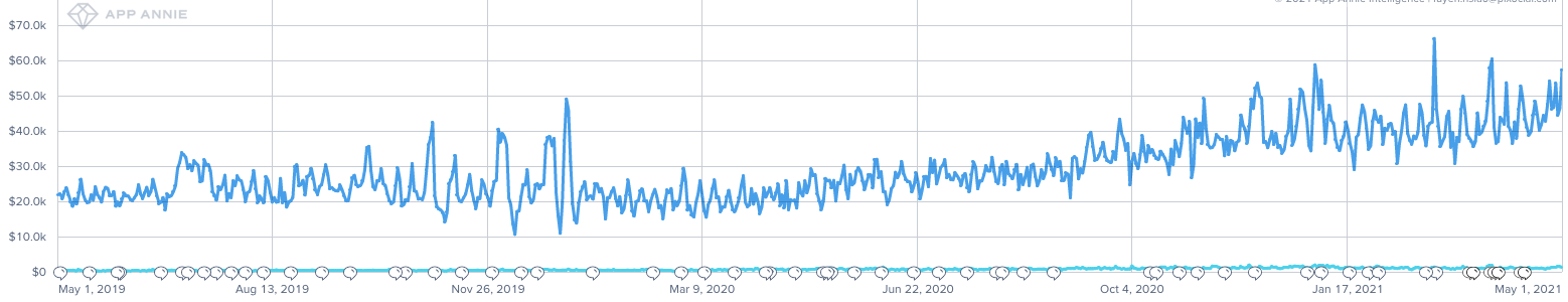
Daily revenue trend from May 2019 - May 2020 from App Annie
This led to a 261% daily revenue growth ($22K to $58K) in 2 years.
Today, AirBrush is the most successful product among Meitu’s family of apps.
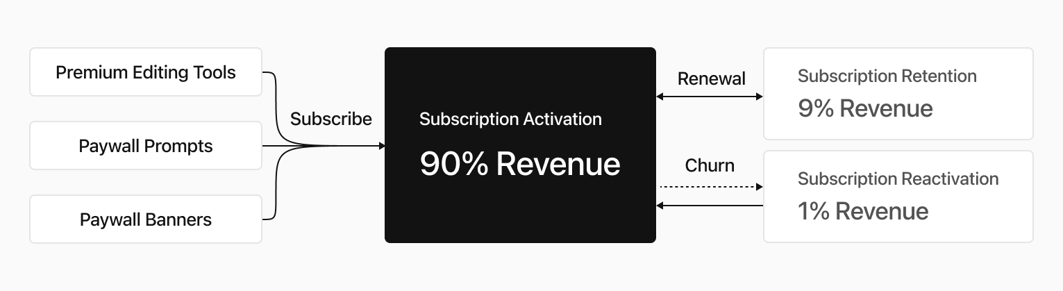
Focusing on Activation
Our growth strategy was focused on activation as the key driver of revenue. With Activation responsible for 90% of our revenue, we understood that this metric was critical to the success of our business.
To improve Activation, I established 4 primary design missions.
Working to improve most frequently used and most valued features making them more powerful, and more intuitive.
Carefully designing and placing the Premium Indicator throughout our product in a way that was both prominent and intuitive to users
First impressions are critical throughout the subscription journey and ensuring that new users were able to quickly and easily understand the value of our service.
Centering around creating features that would enhance our marketing efforts from our marketing team’s research that identified emerging trends in the photo editing industry.
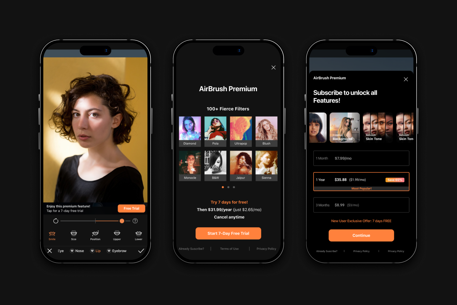
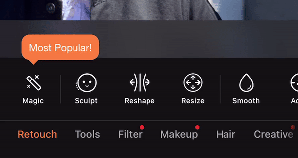
1. Optimizing Popular Features
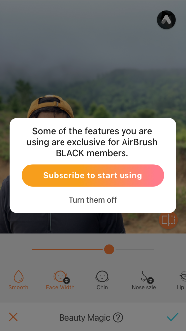
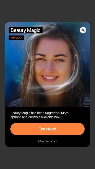
“Beauty Magic” is a free feature that is highly popular among the users of the product due to its high CTR and Save Rate. It provides accurate auto-retouching options, which means it can help improve the photo with only one tap.
To build on the success of this feature and enhance its capabilities, we decided to add more tools to it. These additional tools have been included in a premium tier, which means that they are only available to users who pay for the product.
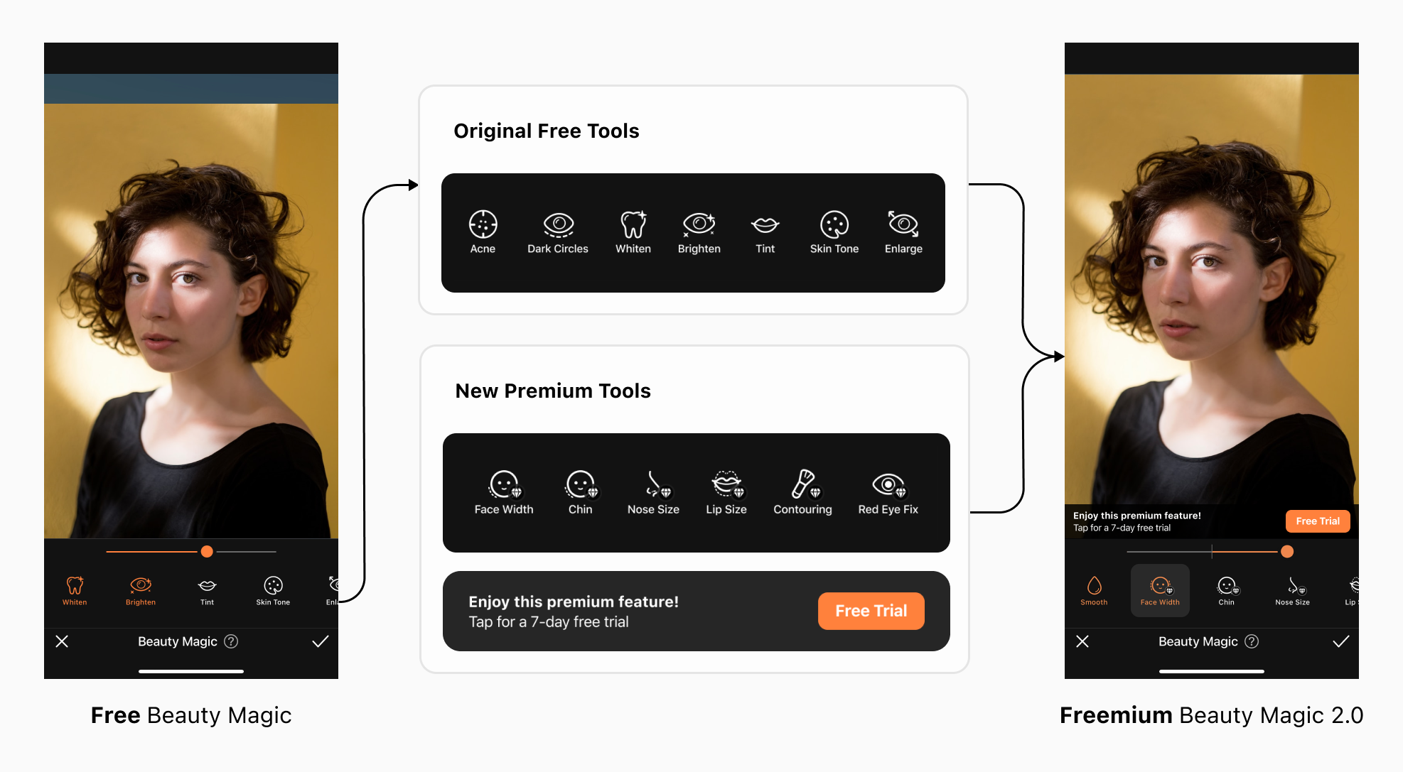
As of today, "Beauty Magic" holds the #2 for profitability, largely due to successful conversions from our freemium model.
Designing for Equity
By providing users with a higher degree of customization, Beauty Magic 2.0 caters to a wider range of users with different preferences and needs. This allows users to modify their faces in ways that best suit their individual requirements, resulting in a more equitable experience for all users.
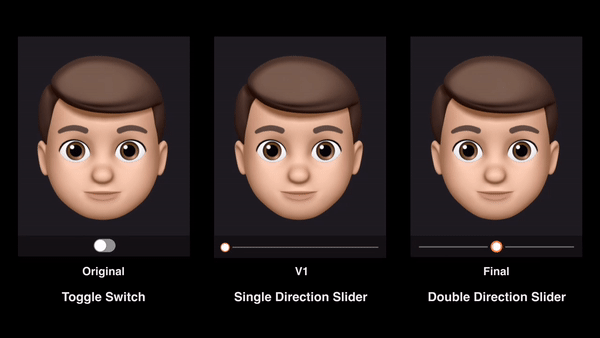
In the initial version of Beauty Magic, the Switch toggle only provided users with the option to turn the effect on or off. This did not cater to users who may have different preferences or needs. In Version 1, I explored a single direction slider that allowed users to decrease the size of the face. This provided a greater level of customization but was still limited in terms of options.
In the final version, I decided to use a doubler direction slider that not only allowed users to decrease but also increase the width of the face.
Unexpected Problem
Upon announcing Beauty Magic 2.0, we experienced a decline in ratings on both iOS and Android platforms:
App Store’s rating: 4.9 → 4.7
Google Play’s rating: 4.7 → 4.6
““I can’t save Beauty Magic without a subscription. It’s supposed to be FREE!! 👎””
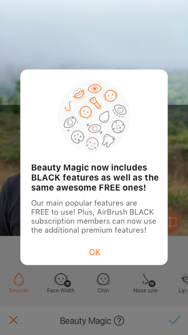
I had assumed that users would have a clear understanding of how the Freemium model works, but I was wrong.
It turned out that some old users believed that Beauty Magic 2.0 was still a free feature, which was not the case.
Launching an Emergency Build in 3 Days
In order to secure our ratings, I needed to remove the confusion surrounding Beauty Magic’s free features by creating solutions step by step throughout the user journey.
1. Entering Beauty Magic
For Old Users
Introducing the New Freemium Popup-This would help users comprehend the new freemium update.
2. Browsing Features
For All Users
Using visual cues and clear labeling to indicate which features require payment. This can help users to easily identify which features are included in the free version of the product and which require an upgrade.
3. Using Features
For All Users
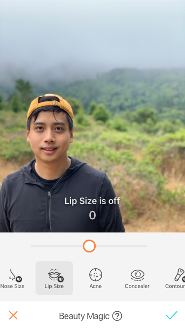
For the freemium model, it is important to be transparent with our users about which features are applied. When a feature is turned off, I needed to provide clear feedback and explanations to the user:
Show the Text Hint
Add the Haptic Feedback
4. Saving the Work
For Old Users
By providing a clear reminder to the user before they save their work, I can ensure that they are fully aware of the premium nature of the feature and the cost involved in using it as well as have an option to turn them off.
After 1 month, ratings went back to normal
By improving the transparency by addressing premium features clearly, we were able to save the app rating after the new freemium model was launched.
2. Showing Premium Indicators
To showcase premium indicators throughout the product with visual anchors, clear labeling, and other design elements that help users to understand which features require payment. In this context, Showing Premium Indicators is a critical aspect of design that helps to improve subscription activation.
Balancing User Needs and Revenue Goals
Initially, I was cautious about distracting users from the photo editing experience, so I designed a small banner to promote our premium subscription features. However, the results were disappointing, with low conversion rates and little impact on revenue.

User-Centric but Effectively Invisible
This premium banner didn’t distract users from editing. However, it wasn’t noticed because the size was too small and it faded out too fast.
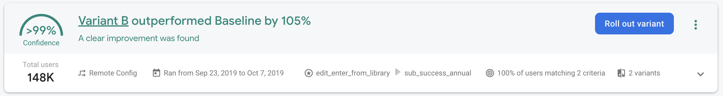
In response, I decided to experiment with a larger, more prominent banner that showcased our subscription benefits in a straightforward manner.

More Straightforward
Big visual anchor
Show subscription benefits
Clear paywall entrance
Display the info constantly
My findings revealed that promoting product values in a straightforward way:
Showing a big banner with subscription benefits, led to an impressive +105% conversion rate
Existing Patterns VS. New Animation
Learning from the success of our banner experiment, I continued to experiment with design approaches to further optimize premium visual indicators.
Our previous experience with a popup to promote the premium features had produced underwhelming results in terms of increasing conversions.
Existing Popup
Popups are our most frequently used design patterns across the app, but it had very low CTR in terms of promoting popular features.
I believed that an animation could create a more engaging and interactive experience for users, drawing their attention to the premium feature and emphasizing its value. I also assumed that an animation could help to create a sense of excitement or intrigue for the user, and encouraging them to take action.
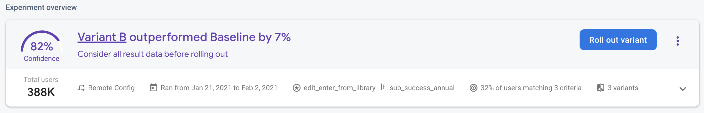
One key finding was that adding an icon dynamic animation to promote the feature Beauty Magic resulted in a significant 7% increase in conversions.
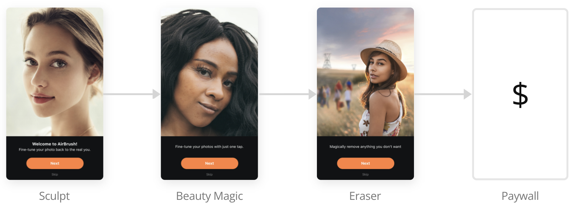
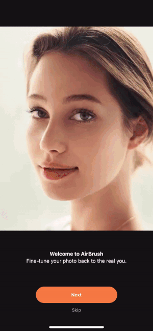
3. Enhancing Onboarding
With an effort to increase subscription activation and revenue, I were exploring ways to enhance our onboarding process. One potential approach was implementing a paywall in the onboarding process, where users would be prompted to choose a subscription plan before being able to access the app's full features.
Would People Pay without Trying?
This approach assumed that users are willing to pay for a subscription at the beginning of their onboarding process and that a paywall will not be too disruptive to the user experience.
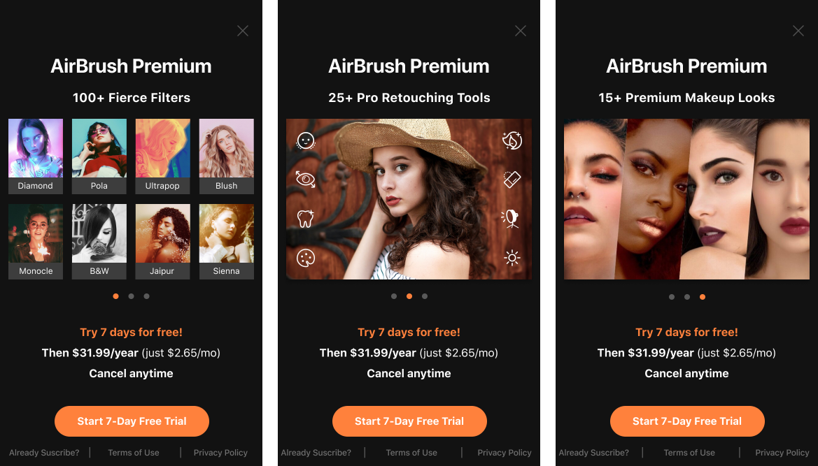
Considering the possibility that users may be unwilling to pay for a subscription before trying out the app, I designed a paywall with subscription perks immediately following the feature intro.
My goal was to strike a balance between promoting the premium subscription and maintaining a positive user experience. To achieve this, I incorporated a variety of value propositions into a horizontal carousel that users could easily scroll through.
Overall, by combining these design approaches and focusing on a user-centric design approach, I hoped that this design would drive revenue growth.
New Flow
Showcase the most impressive features from the start
Fast follow with a paywall & perks
Shorten the conversion funnel directly by guiding users through to the final transaction
Yes, people would subscribe to AirBrush without trying!
By showing the paywall through onboarding, the conversion rate increased +42%, and became the #1 conversion source.
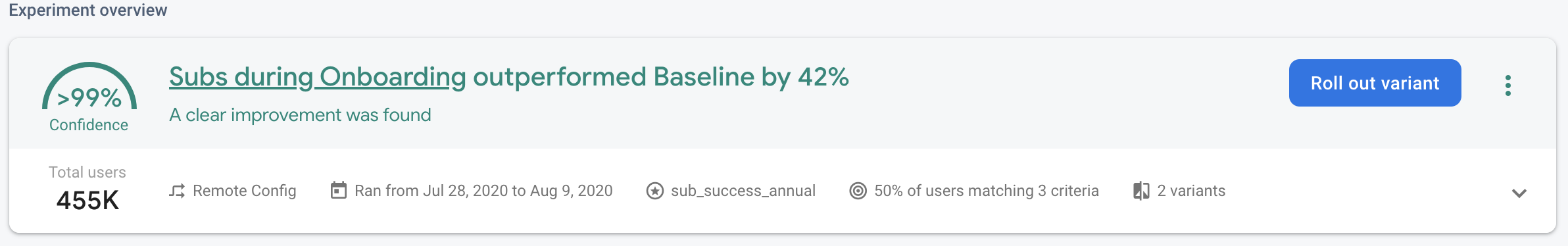
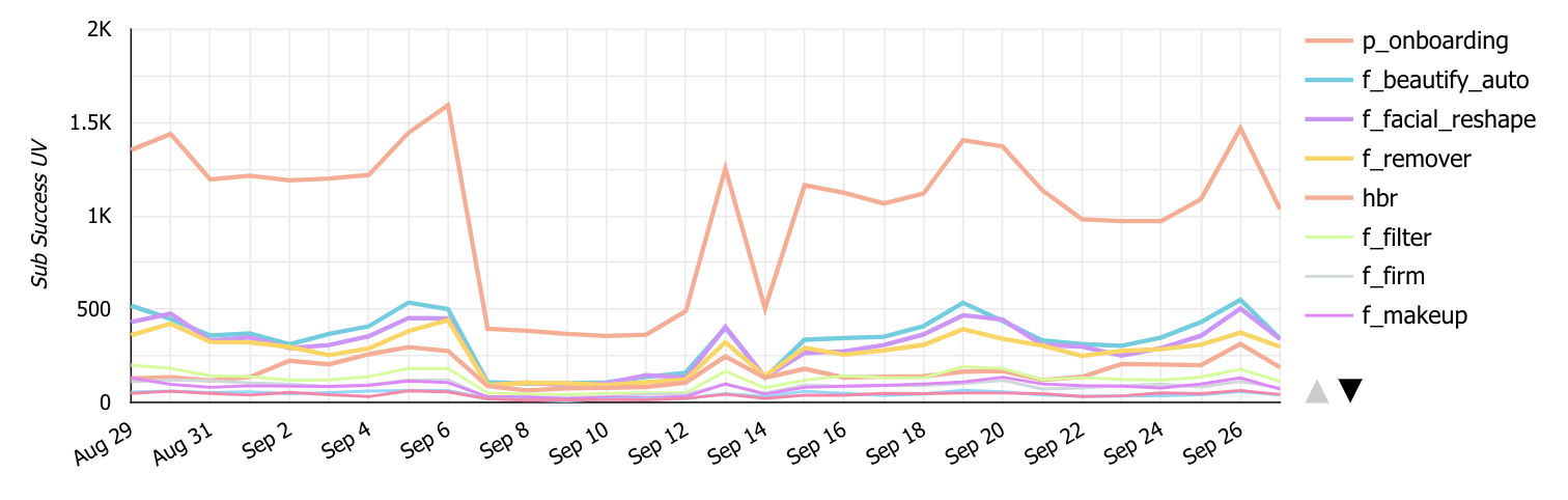
This graph shows the conversion from the above video (p-onboarding) performs much better than any premium tier features.
4. Creating for Marketing
As a product designer, one of my key goals is to create experiences that effectively promote our product and drive revenue growth.
Gamified Discounts: Spin to Win
By using gamification elements into our marketing campaigns. I hoped to create a sense of excitement for users. This would help to build engagement and brand loyalty, while also incentivizing users to take action and convert. Using a game of luck could be a fun and interactive way to engage users and incentivize them to take action.
Game Design Process
Variable Rewards
By incorporating variable rewards, such as different discounts, I was able to create a sense of excitement and anticipation for the user.
Delighters
Additionally, I aimed to incorporate , such as dynamic animations that could help to build a memorable experience.
Endowment Effect
Finally, I recognized the importance of the endowment effect, which involves valuing things more highly simply because we own them. By creating a sense of ownership and investment in the game, I would deepen the user's attachment and use the prize they earned to subscribe to AirBrush.
Interaction Breakdown

Before Spinning

Spinning
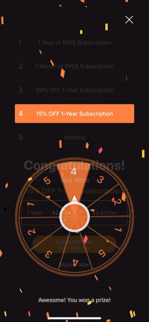
Won a Prize
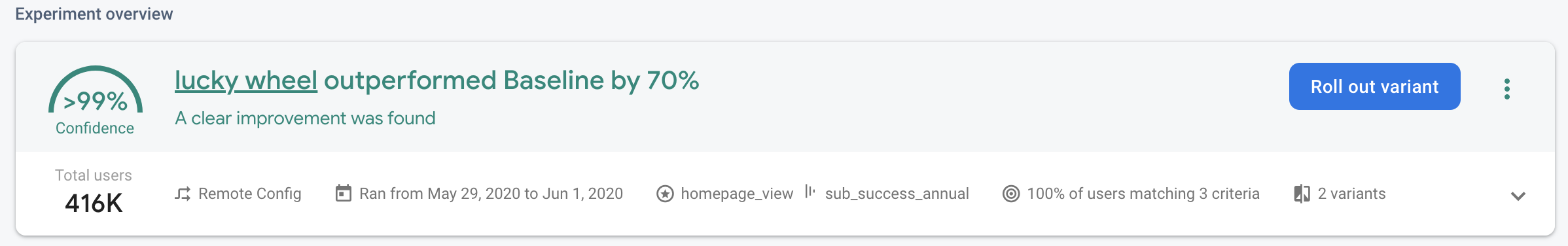
Lucky Wheel promotional game increased conversions by 70% compared to a basic promotion.
Retention
Our retention strategy aims to deepen user engagement and encourage long-term commitment to our service, while also driving revenue growth and increasing customer lifetime value.
Encouraging Long-term Commitment
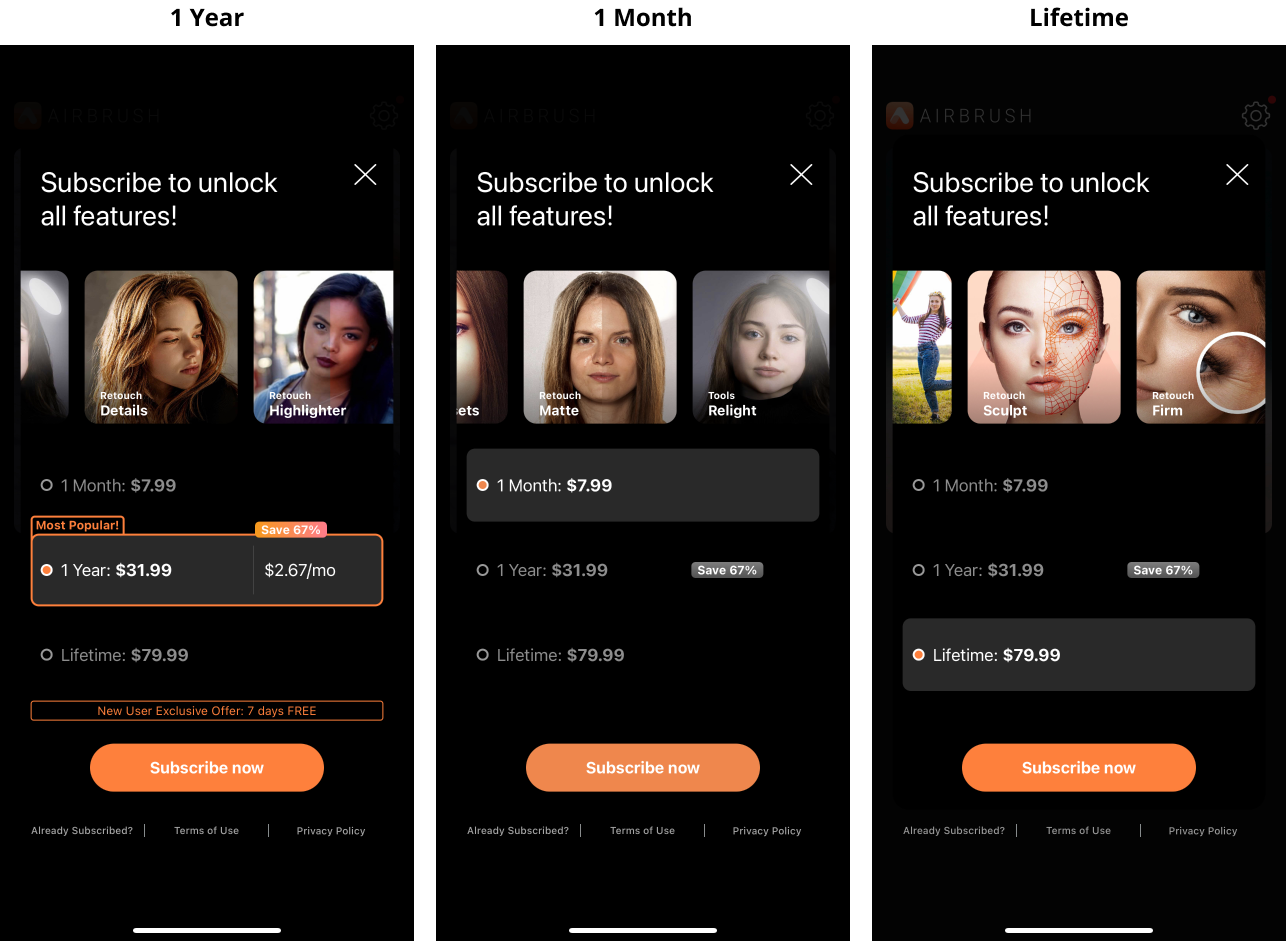
Designing an optimal annual payment cycle to encourage user sign-ups and long-term commitment. We believe that the payment cycle should be designed to align with the user's perceived value of our product. By offering annual subscription options, we can encourage users to make a greater commitment to our platform and foster a sense of loyalty over time.
Design Principles to Encourage Annual Plan Sales:
Default Bias
Pre-selecting the annual plan as the default option can help to nudge users towards choosing it without requiring any extra effort on their part.
Appealing Discount
Offering an appealing discount of 67% for choosing the annual plan can help to incentivize users to commit to a longer-term subscription, while also providing significant cost savings.
Exclusive Annual Plan Offer
Providing an exclusive 7-day free trial for the annual plan can help to create a sense of exclusivity and encourage users to explore the premium features.
Social Proof
Highlighting the annual plan as the most popular option can leverage social proof and influence to encourage users to choose it over other subscription options.
Decoy Effect
Offering a lifetime subscription as an even more expensive option can create a decoy effect that makes the annual plan seem like a more reasonable and appealing option.
Another retention strategy we are exploring is customization with the goal to encourage our users to build their own unique experience on our platform.
The IKEA Effect
The IKEA effect is a cognitive bias that describes the tendency for people to place a higher value on products or experiences that they create themselves. This would create a sense of pride and ownership that helps to increase engagement and foster long-term loyalty.
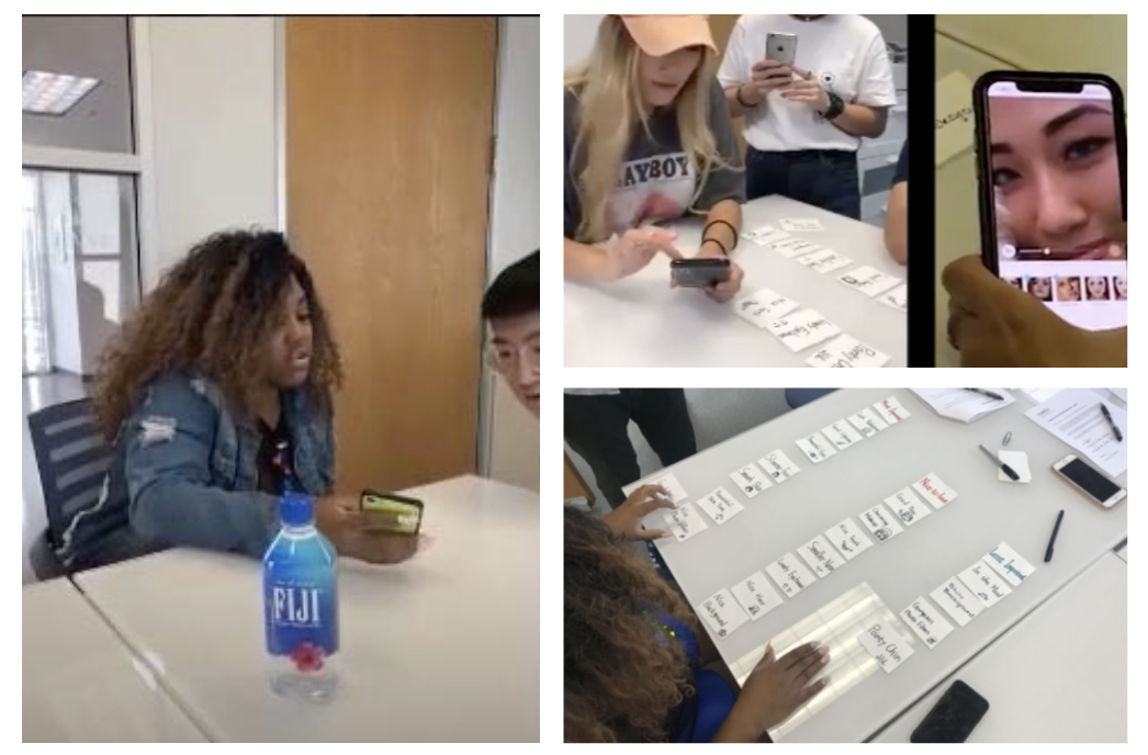
User Interview
As part of the efforts to implement the IKEA effect in our product, we conducted a series of in-depth user interviews and card sorting activities to gain insights into what our users want to build and create on our platform. During these sessions, we asked users to share their preferences, goals, and interests related to photo editing, as well as their experiences with our product.
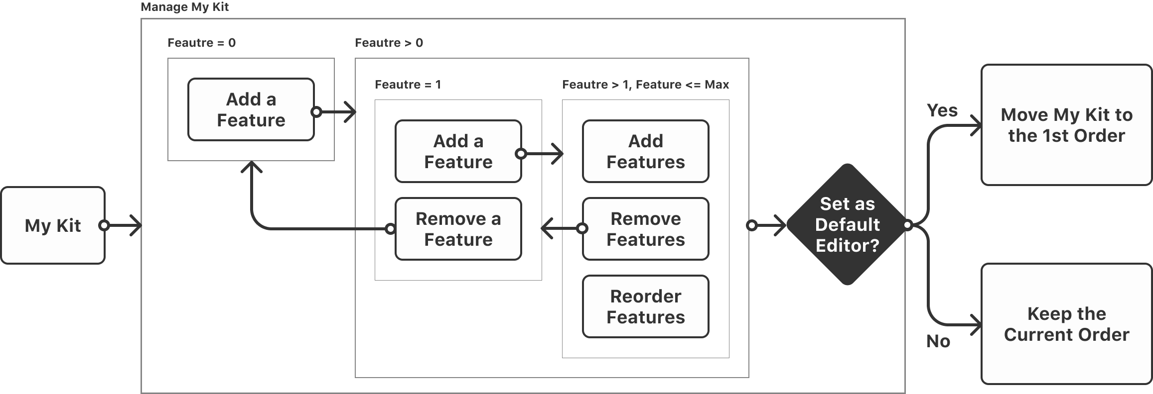
The Creation of the "My Kit" Feature
Through our user interviews and research, we have found that our users highly value customization in their photo editing experience.
“I hope the app only shows features I need.”
“The biggest problem of most photo editing app is it’s hard to find features I want.”
“Some features I like are placed at the vary end, so I need to scroll all the way to use them.”
After carefully considering our users' feedback, we decided to develop a customized tool box feature, which we named "My Kit".
The goal of the "My Kit" feature is to provide our users with a more personalized and streamlined editing experience by allowing them to easily access their most frequently used editing tools.
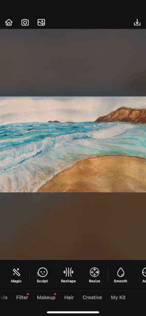
My Kit- User's personal editor
A customized tool box that enables users to add any features and access them quickly.
My Kit Design Iteration
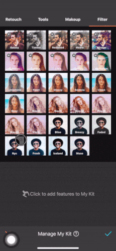
UI Problems
Uncomprehended Element
Lack of signifiers of adding and removing features
Physical Challenge
Hard to reach the top nav bar
Information Overload
Filter & Makeup lists are very busy
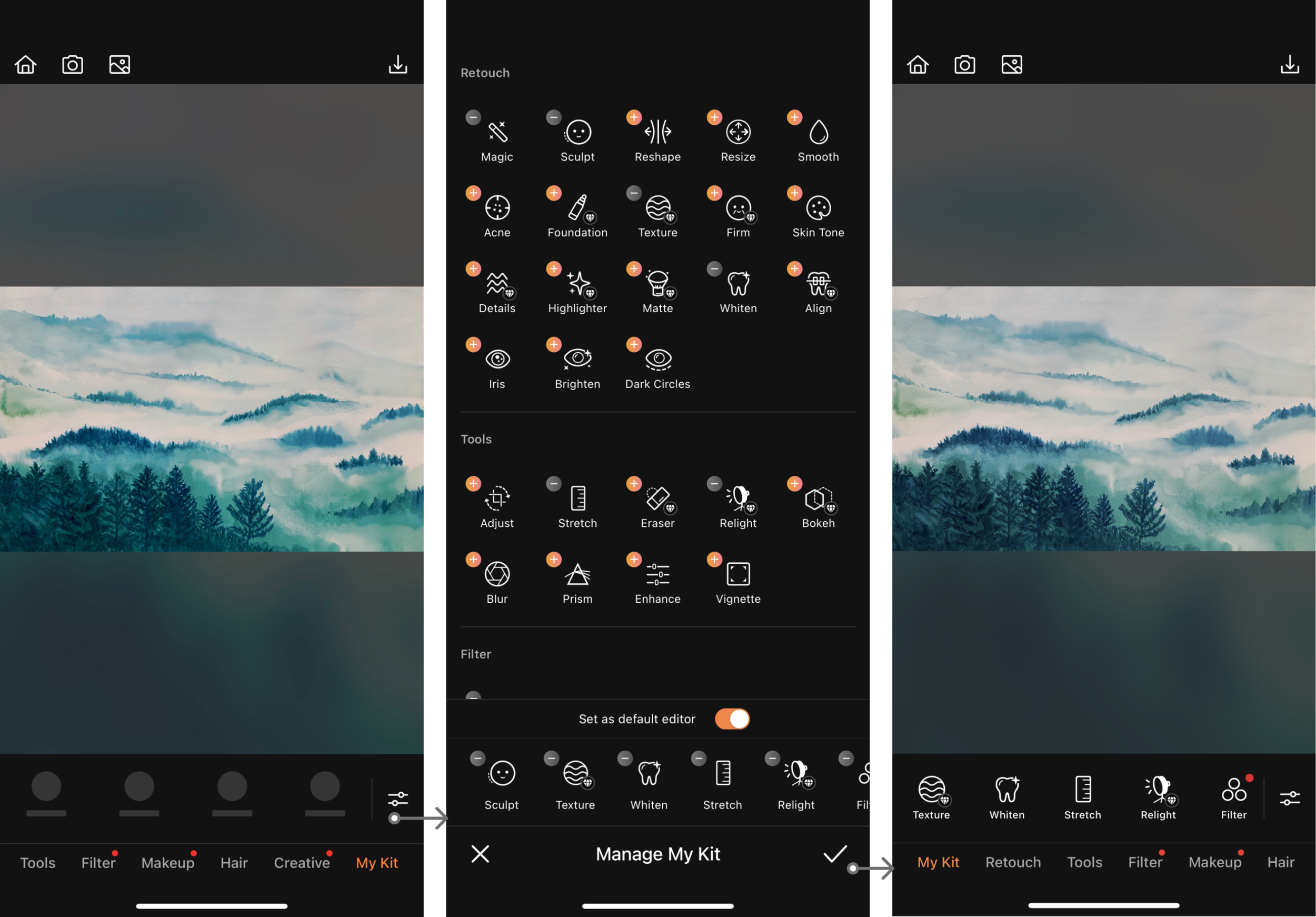
My Kit Final Design
More Intuitive Feature List
Show the Add and Remove buttons near features
Remove the top nav bar to create a smooth vertical scrolling experience
Only show entrances of Filter & Makeup , and remove all single thumbnails. If users want to manage filter or makeup options for an easy access, they are able to do that in the newly established Favorites feature shown below.
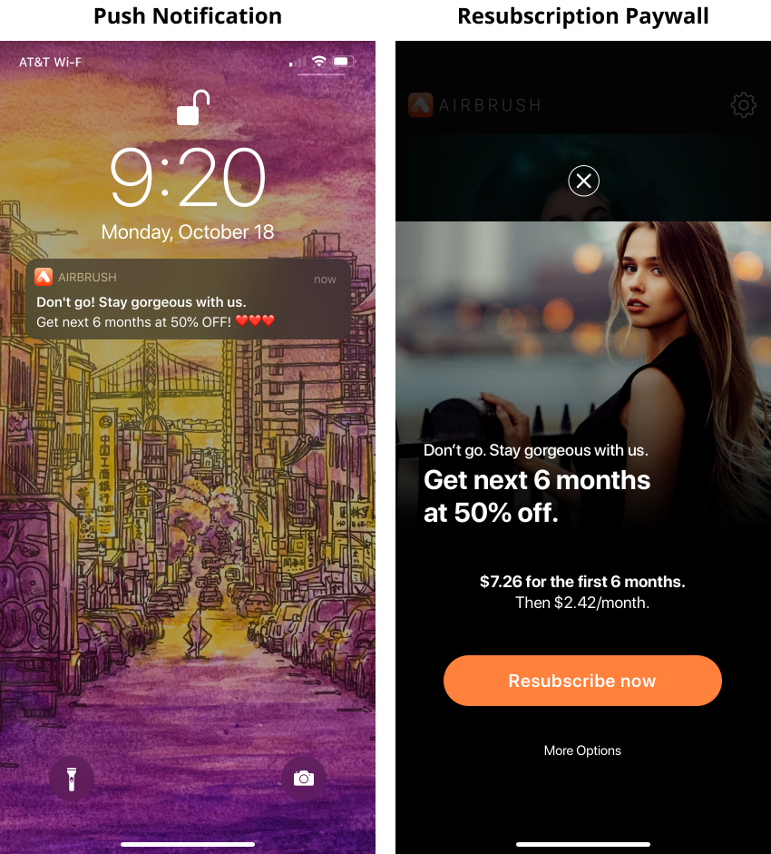
Reactivation
To win back churn users and improve reactivation, I began by conducting user interviews to gain insight into why they left our service.

In conclusion, our user research has revealed:
Photo editing app users tend to look for FREE alternatives.
“I only use few premium-tier features, and I believe there are some free apps can do the same.”
“I am not taking that many photos anymore, a free photo app works just fine for me”
“I just found a free app offers the same feature, so I canceled my AirBrush subscription.”
Based on the research, we can use discounts as a targeted strategy to win back churned users. By offering a discount on our subscription plans or premium features, we can incentivize users to return to our platform and provide them with a cost-effective solution.
However, it is important to use discounts strategically to prevent devaluing our product and negatively impacting our revenue. Therefore, we will need to analyze user data and A/B test different discount options to determine the optimal discount rate that is both appealing to the user and financially viable for our company.
Nudging them with the Introductory Price
In conclusion, nudging churned users with an introductory price can be an effective strategy for reactivating them and encouraging them to return to our photo editing app.
For example- Get a 50%-off offer before paying the full price
What I’ve Learned
Growth = Finding 20% of causes that contribute 80% of the result
✌️ Thank you for taking the time to go through this extensive case study! One of the key takeaways is that growth can be driven by a few critical factors that have a disproportionate impact. This is known as the Pareto Principle, which suggests that 20% of the causes can be responsible for 80% of the results.
By constantly identifying and prioritizing these vital few factors, we can focus our efforts and resources on the areas that have the most significant impact on growth.