App Redesign- AirBrush
Project Timeline
Feb. 2021 - Jun. 2021
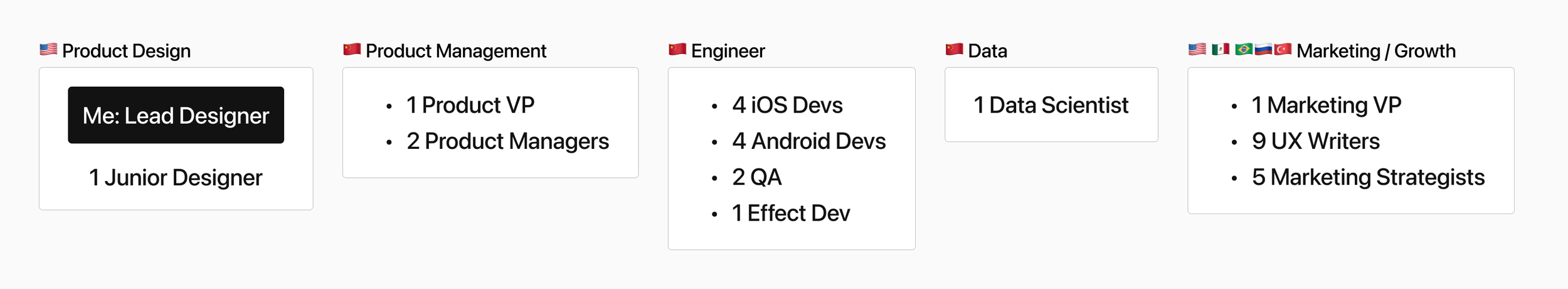
My Role
Structured redesign strategies, expanded the design team with a newly-hired junior designer, rebuilt the design system, user research, visual design, and motion design
Stakeholders
Background
When I joined the team in 2019, due to the team’s focus on revenue-driving design and limited resources, the team decided to put off optimizing interaction and visual design. After a successful 2-year rapid growth phase, AirBrush entered 2021 in the financial position (+267% MRR, Monthly Recurring Revenue).
However, the app still had many UX problems that weren't prioritized during the rapid growth period. I wanted to elevate the app’s UX foundation, and establish the design pipeline across different products and teams for sustainable longterm growth.
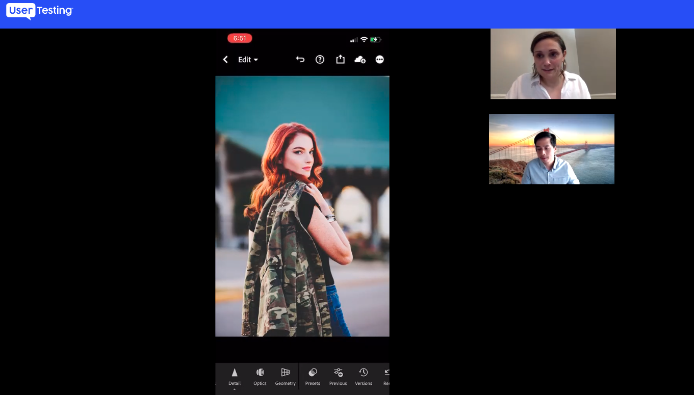
Gather User Insights
To initiate the redesign project, I began by valuable user insights.
What Does an Easy-to-Use Photo Retouching Experience Mean to You?
"Find features I want easily"
"Simple and clean interface"
"Help me finish editing quickly"
Pitch the Redesign Vision
With user insights, I presented the redesign vision to our product VP & CEO, focusing on:
Engaging - A sleek and captivating UI
Seamless - A fast and seamless editing journey
Accessible - Discoverable and easily accessible features
With CEO support, I will translate the redesign vision into actionable steps to drive the project forward.
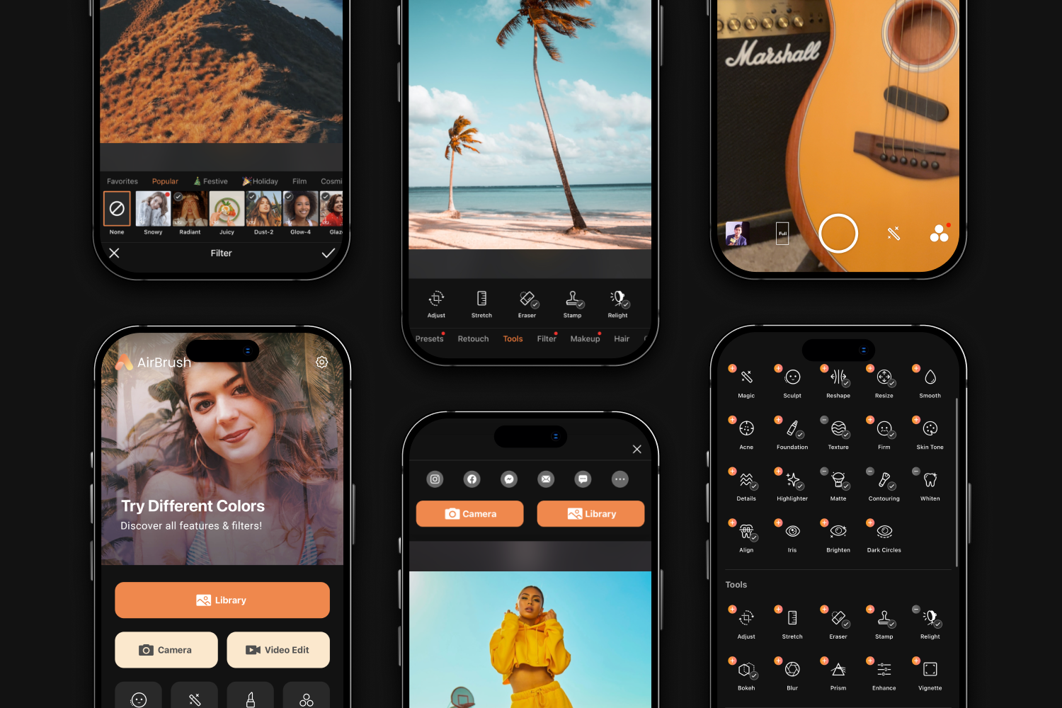
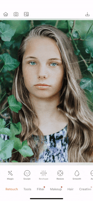
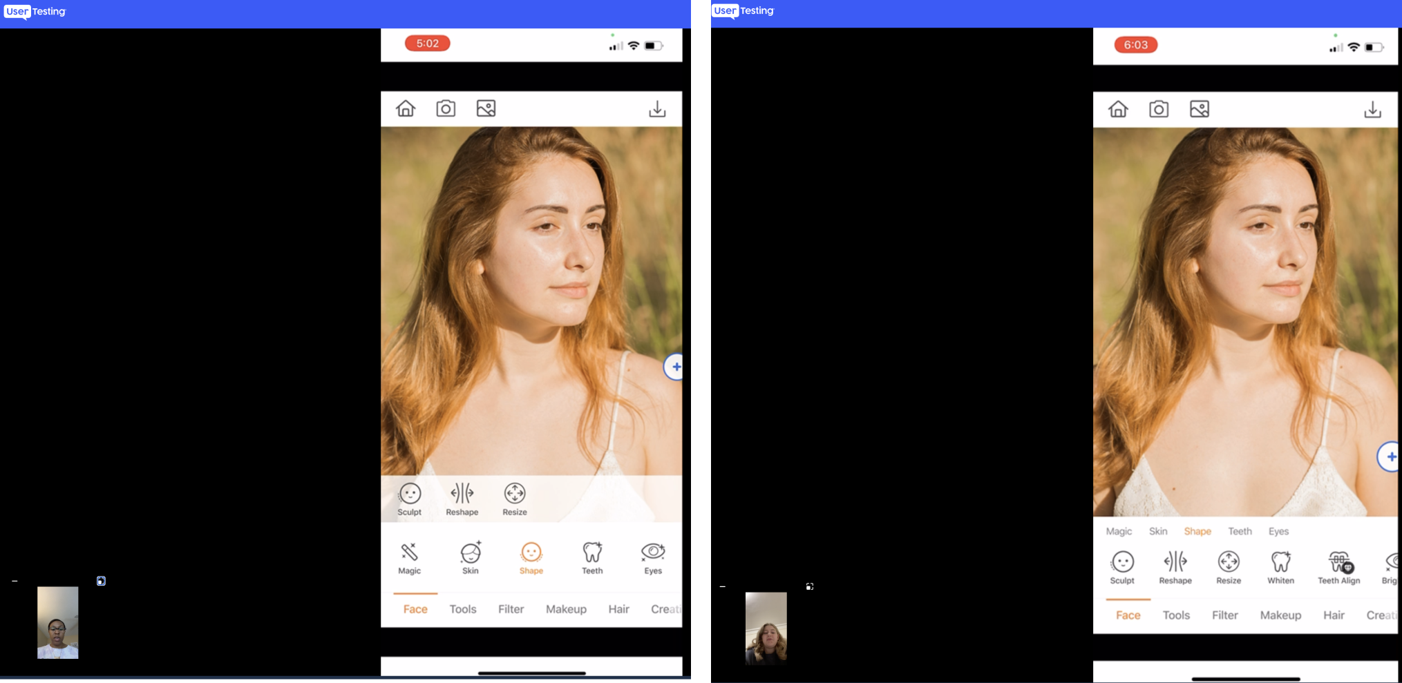
1. Sleek UI
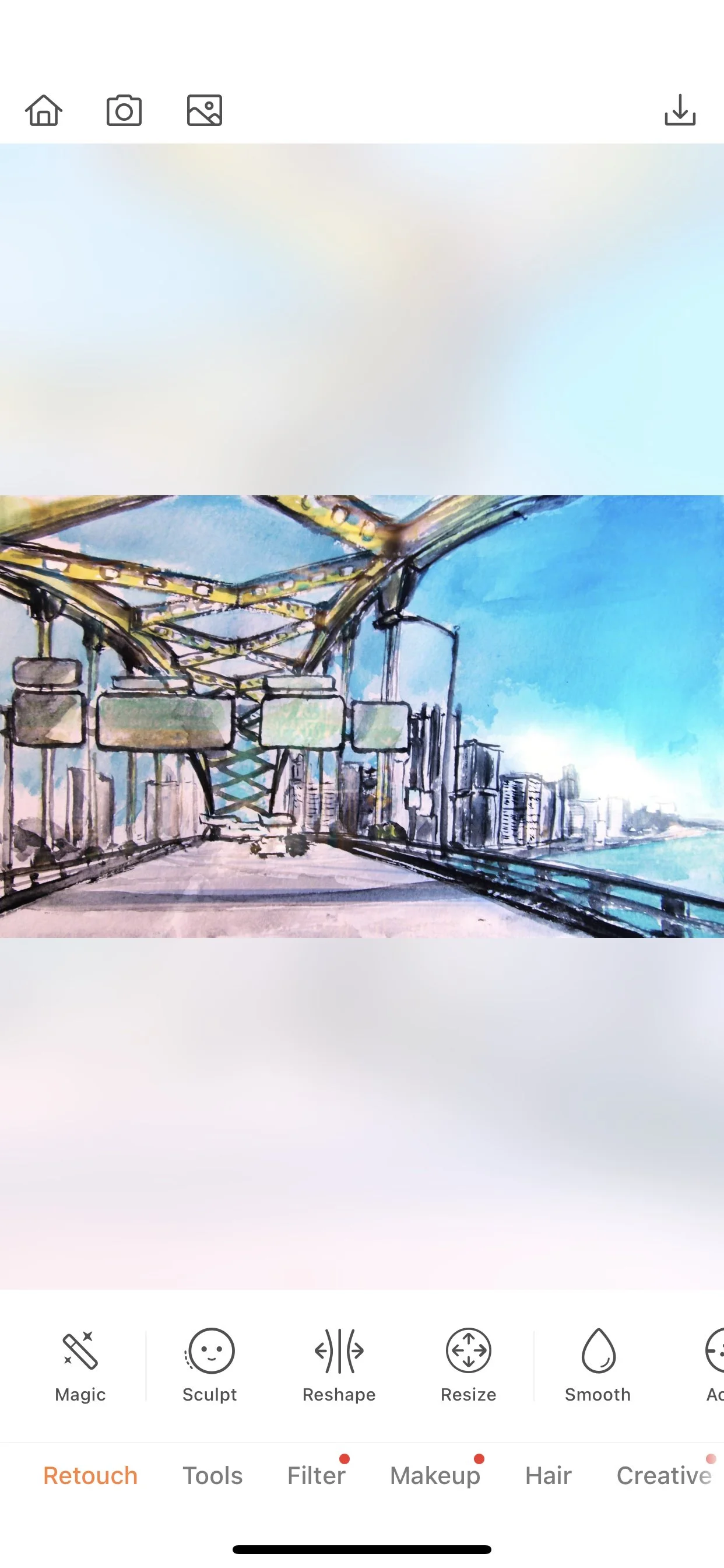
Redefine Layout Constraints
The previous layout strategy was making it easier to manage the editing area by fixating its ratio and stretching the menu height based on different device sizes.
However, this way caused too much empty space on the menu that led to an inferior editing experience.
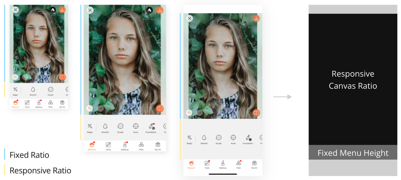

Maximizing the photo-editing area
19% Plus Photo Editing Area
Redefined the feature menu and photo layout across devices in order to maximize the photo editing area
Less Distraction
Removed group icons to emphasize user focus on individual features
Added a top navigation bar to separate navigation and editing interactions
Simplified the compare and redo/undo button visual styles
Pop the photos more by using white on both menu and bottom bar
Better Physical Accessibility
The lower photo editing area helps users brush across the screen easily
Smoother Transitions
Transition animations create a more continuous editing experience
Continuous Editing Experience
Motion Design
Integrate sliding and opacity motions to smooth page navigation.
2. Fast Editing Journey
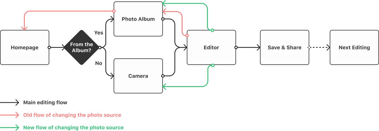
Change the Photo Source Easily
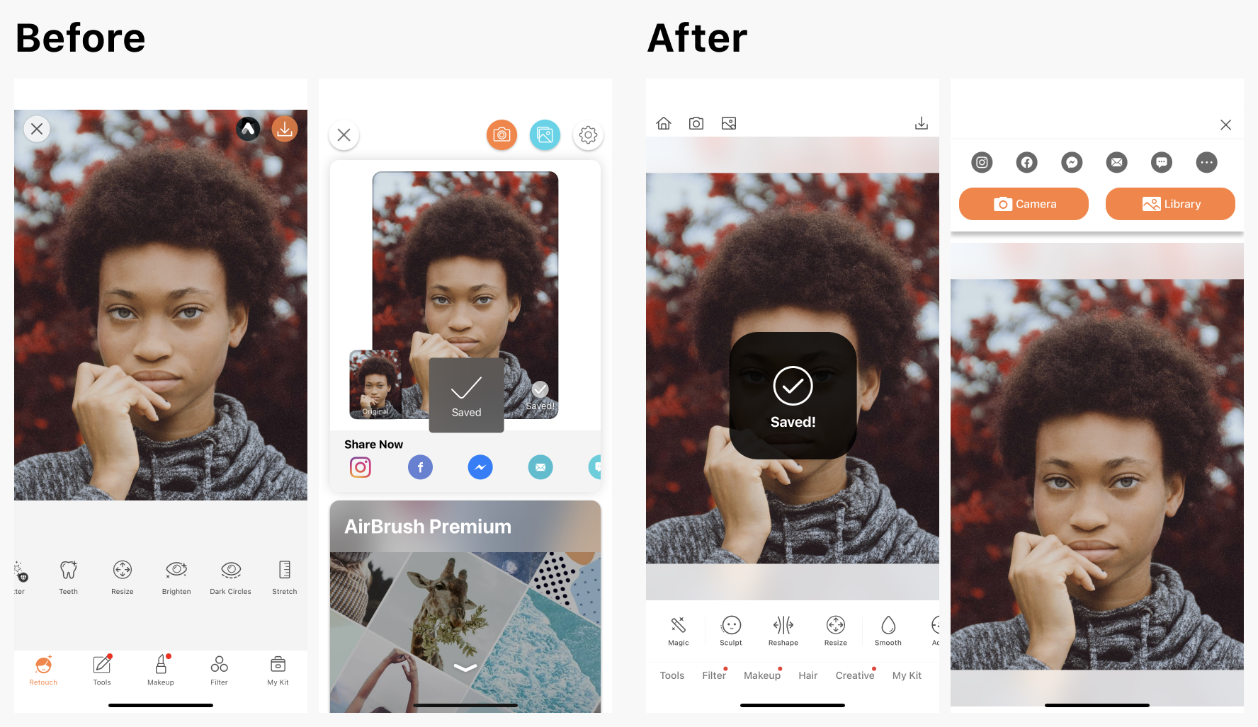
The redesigned navigation enables users to change the photo source from the library or camera quickly without heading back to the homepage.
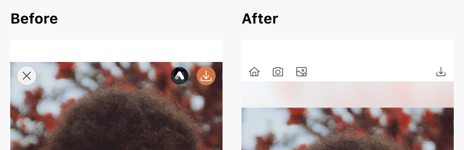
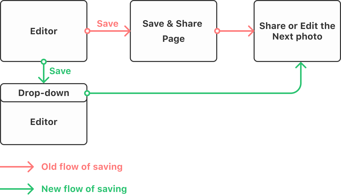
Slick Save & Share Interaction
Instead of jumping to a new page to proceed to saving, users can now finish saving work on the same page. With the share drop-down menu I designed, the photo stays large and immersive without other distracting elements.
3. Discoverable Features
More Meaningful Feature Groups
AirBrush only had Retouch, and Tools groups, so the Retouch group includes many unorganized features which was hard for users to search.
The lack of meaning feature-groups also meant it would get even more confusing with adding new features.
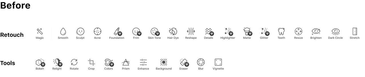
By considering feature types, editing behaviors, and feature revenue data, the PM and I added 2 new groups: Hair and Creative. This created a more meaningful and scalable grouping system.
In Retouch, in order to help users find target features, I grouped them with Beauty Magic, Shape, Skin, Teeth and Eyes, with dividers in between.
Grouping Layout Iterations
Information Overload
The 3-row layout is too much
Uncomprehendive Element
Group labels confuse people
Final Grouping Layout Design
Law of Proximity- Group Features with Dividers
Keep the 2-row layout
Group features with existing names instead of unclear labels
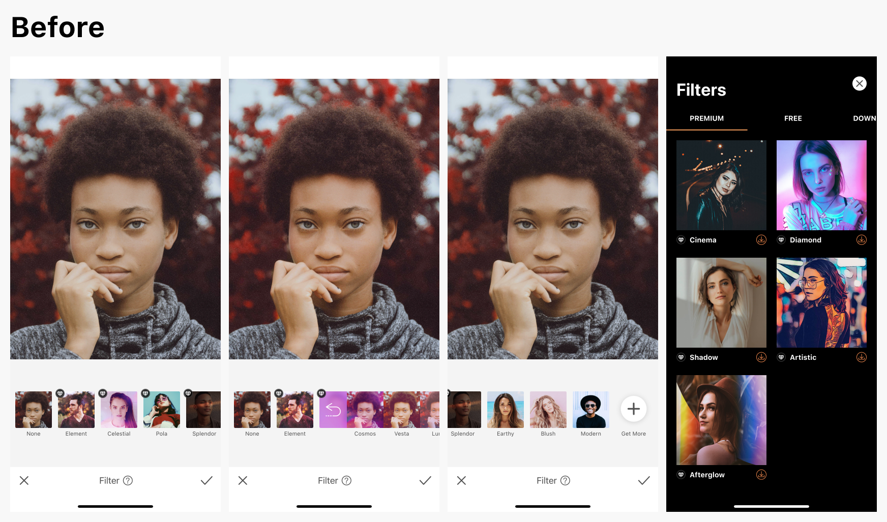
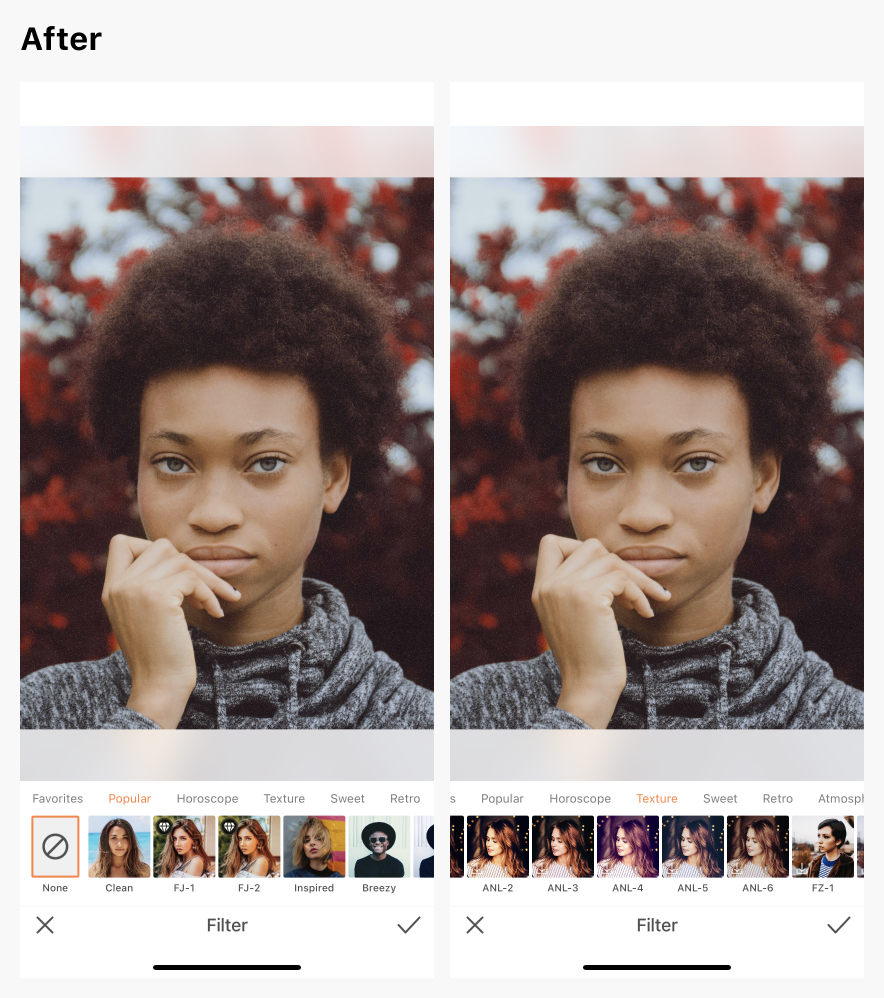
See All Filters at Once
Due to backend technical constraints, we needed to group filters within filter packs, making users expand a pack to see all filters inside. In order to get more filter packs, users have to go to the Filter Shop by tapping the Get More button.
Unfortunately, many new users left the app as a result of this nested filter-pack structure because it seemed like AirBrush didn’t have enough filters.
To correct this issue, we knew we needed to highlight the many Airbrush filters in the app. I partnered with my PM and the engineers to upgrade the backend system so we could feature a layout of all filters at once, within proper groupings. Now, users can pick a filter they like based on popularity, trends, and other use cases.
Redesign Results
Some 5-start review examples about good editing experience & good feature arrangement from the App Store:
“⭐⭐⭐⭐⭐
Editing can be really boring but this app makes it so much fun. I would totally recommend this app, I use it for all kinds of things”
“⭐⭐⭐⭐⭐
It’s quick and easy to use and you’re able to process pictures within minutes!”
“⭐⭐⭐⭐⭐
I love this app for photo editing - if offers an amazing array of tools. Highly recommend.”
What I’ve Learned
Sustainable Growth = User-Centric Design + Pipeline & Process
Sustainable growth in any product or service is achieved by combining two key elements: user-centric design and a streamlined pipeline and process. By placing the needs and preferences of the user at the center of the design process, we can ensure that the final product is tailored to the specific needs and expectations of our users, resulting in greater satisfaction and engagement. At the same time, a well-designed and streamlined pipeline and process can help to maximize efficiency and productivity, allowing for greater innovation and scalability. By combining these two elements, we can achieve sustainable growth that is both user-focused and efficient, leading to greater success and impact in the marketplace.