Website Redesign- AirBrush
☝️Live Website: https://appairbrush.com/
Project Timeline
Nov. 2021 - Jan. 2022
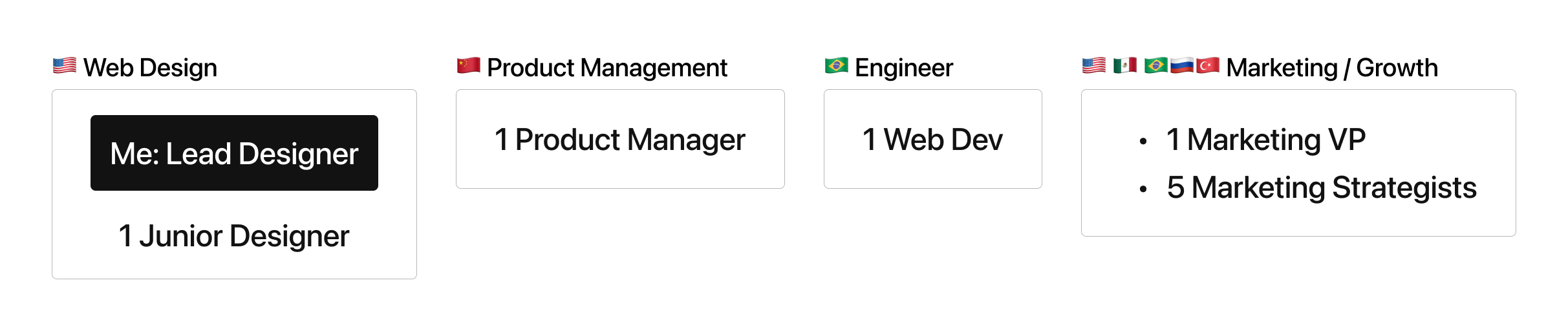
My Role
I was responsible for the end-to-end website redesign:
Interaction design, and visual design (layout, illustrations, and design system)
Stakeholders
Background
AirBrush’s website had been under minimum maintenance for years since our team resource was mostly on developing the mobile app, and paid marketing channels. After AirBrush reached a double recurring revenue in 2021, my team started to plan redesigning the website with the mission to assist the AirBrush app to grow organically.
A compelling website experience is the foundation of showcasing our product value, creating informative and attractive blog posts about trendy photo styles, retouching tips, or any inspirations. We believed this content-driven strategy will lead to better searching results that drive more new app installs eventually.
Refine Business Requirements
First of all, I had some meetings with key stakeholders to understand our visions, and business goals- What do we expect to achieve from this web redesign project?
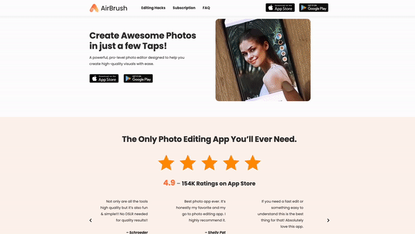
Clear and attractive messaging: Clearly communicate the key features and benefits of the app, and present them in a way that is easy for potential users to understand.
Optimize for search engines: Include relevant keywords in the title tags, meta descriptions, and content that help the website rank higher in search engine results, making it easier for potential customers to find the AirBrush app.
Call-to-action: Clear and prominent call-to-action (CTA) button that directs visitors to download the app. The CTA should be easy to find and should stand out on the page.
Social proof: Customer testimonials, reviews, and ratings to build trust and credibility for the app. This can be a powerful way to encourage visitors to download the app.
Comprehensive information: Dedicated section with detailed information about the app such as feature tutorials with screenshots, and a video walkthrough, as well as a support section with frequently asked questions and contact information.
Mobile First: This site should be designed to be responsive, so that it looks and works well on all devices. Especially over 80% of our site traffic was from mobile phones.
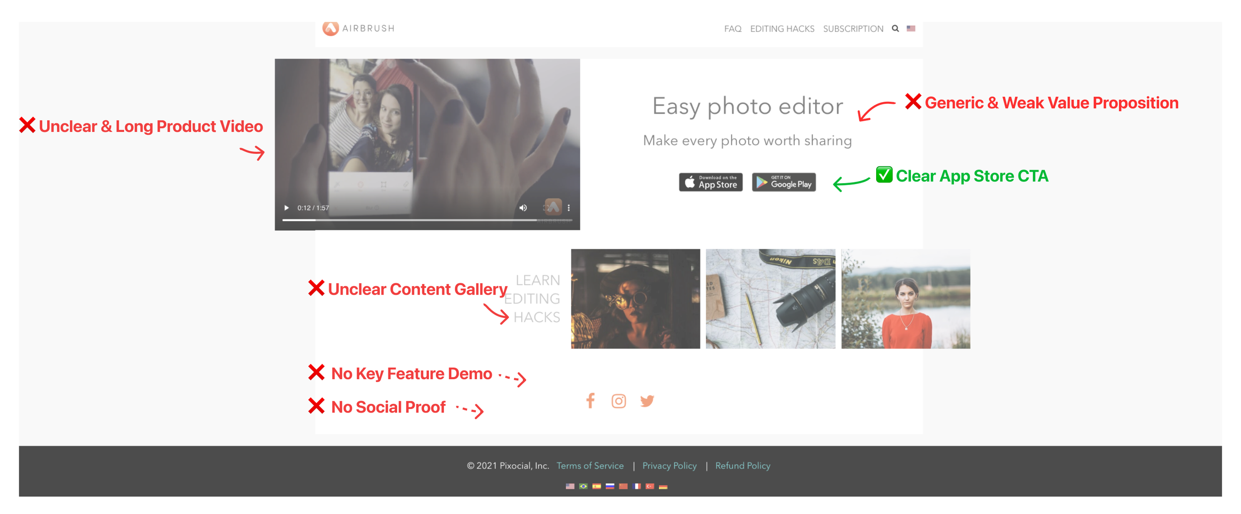
Current Site Audit
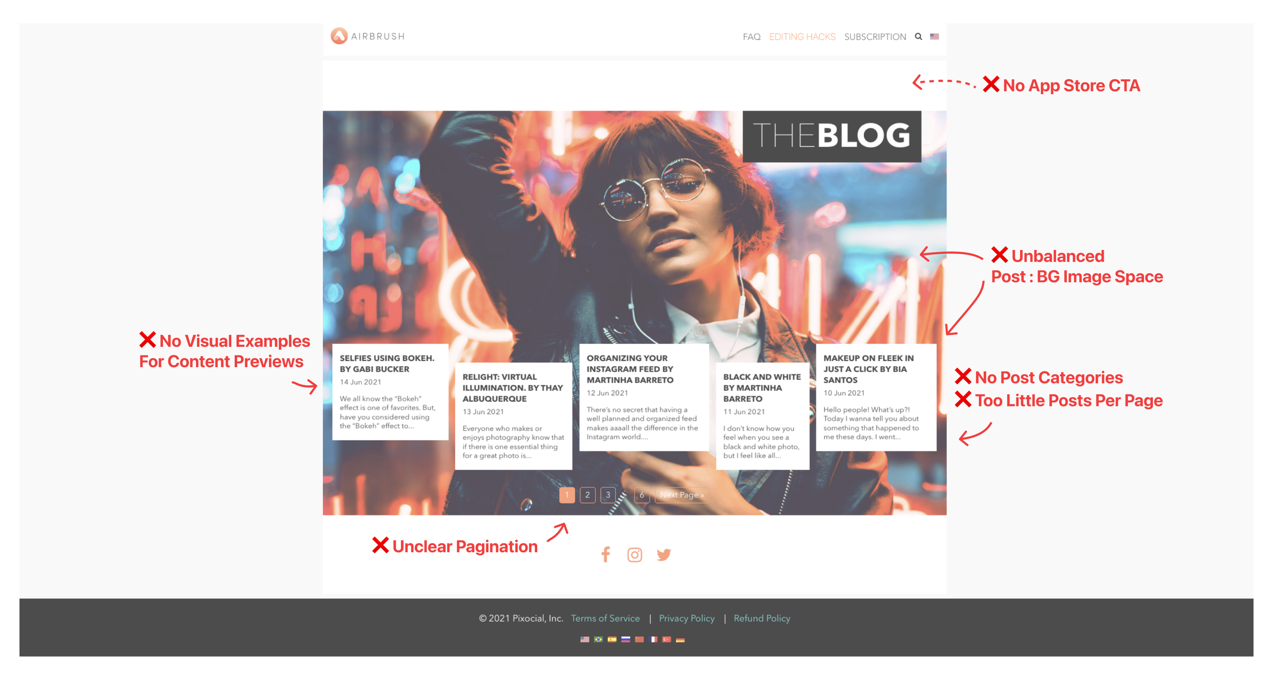
I quickly identified UI/UX problems by auditing the design status quo according to the refined business needs. Below is the example of the landing page and the blog page.
Landing Page
Lack of compelling value proposition and key feature demo
Blog Gallery Page
Weak blog reading experience with unpolished UI layout and components
Redesign
Visual Redesign
The old design style was outdated and cluttered. After the audit, I started with establishing the new visual style according to AirBrush’s branding / design system I created during the App Redesign Project I led.
💡 Be Creative
To align with AirBrush’s most important brand spirit- Be Creative, I chose the bolder and smoother font- Poppins to give a sense of energy and creativity across the site. Also, to match the Poppins style, as well as provide a softer, and more approachable look, I used many rounded corners on images and buttons.
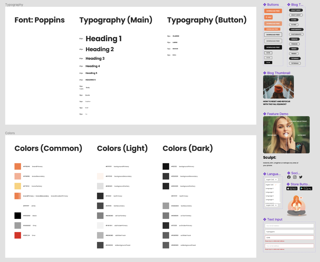
Simple web component library on Figma includes typography, colors, buttons, menu, and illustration.
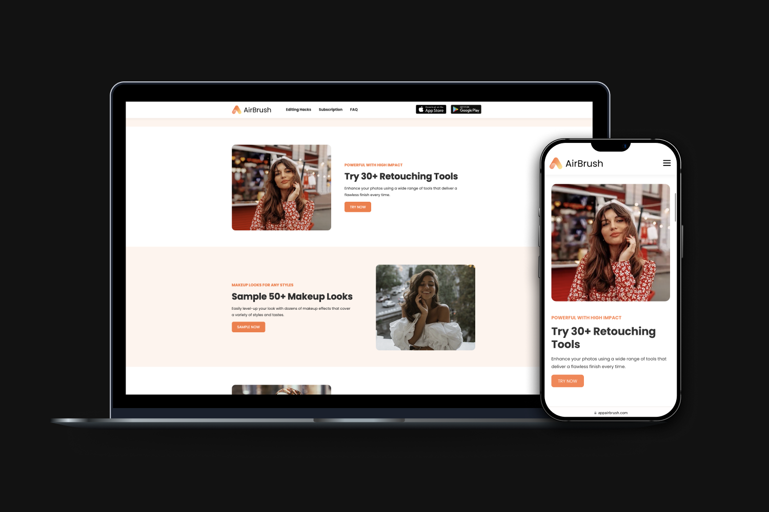
Landing Page
Landing page’s information flow that centers on showcasing our product value and encouraging visitors to download the AirBrush app.
I breakdown the landing page with Content sections, my design purposes, and the element I created to serve the purpose:

Blogs
Blogs are important for AirBrush. They can help use to reach more people, establish trust and credibility, generate leads and build a community, all while being cost-effective and measurable.
Gallery Page
Blog galley is the page where visitors are able to preview posts. The design principles here are:
Clear navigation: Clear navigation menu that allows users to easily find and access posts.
Categories: A list of categories or tags should be included on the blog page to help users quickly find articles that are relevant to their interests.
I breakdown the landing page with Content sections, my design purposes, and the element I created to serve the purpose:
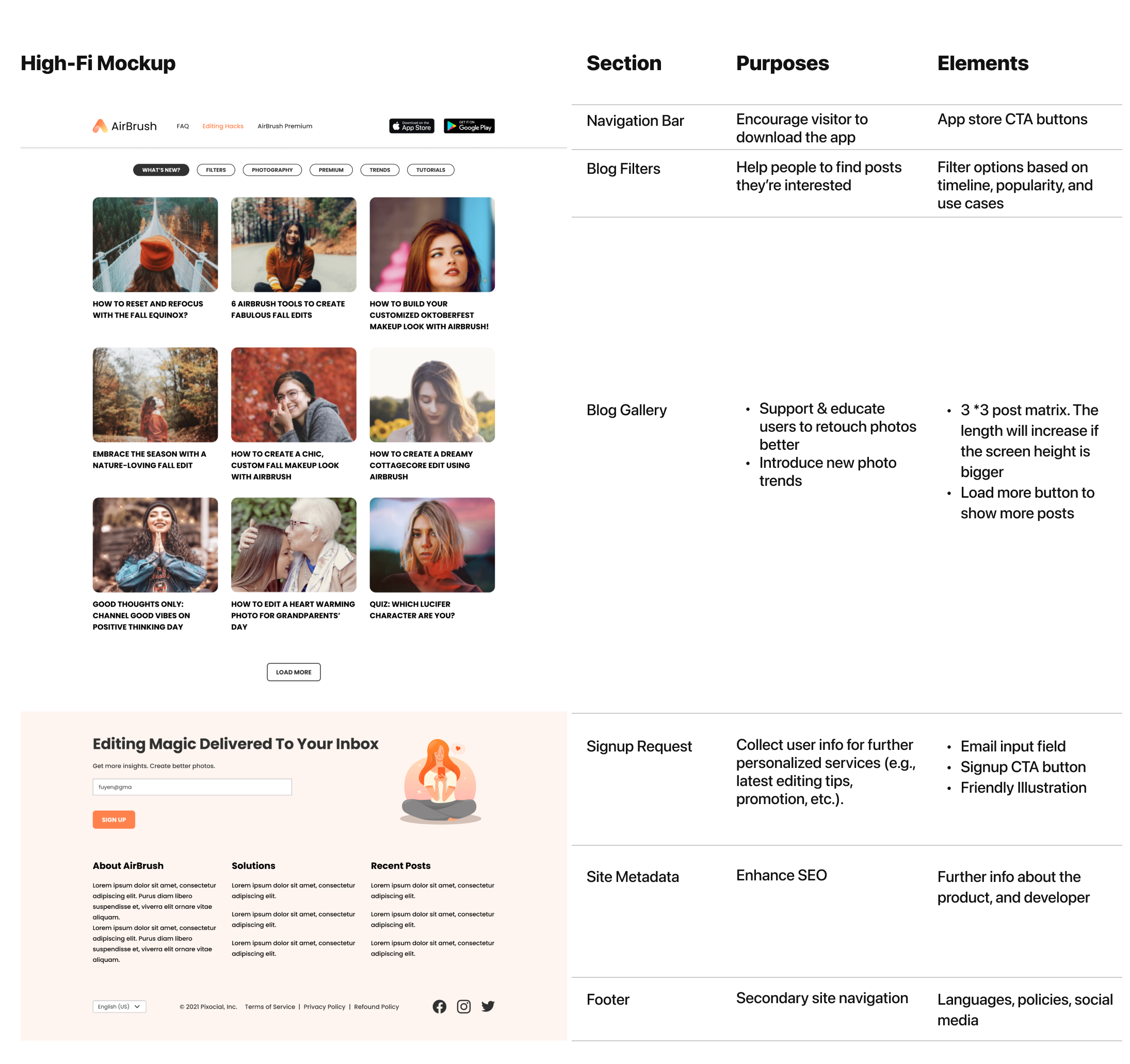
Why I Used “Load More“ to Replace Pagination?
There are several downsides to using pagination here:
Increased clicks: Pagination requires users to click through multiple pages to view all of the content, which can be time-consuming and frustrating.
Increased complexity: Pagination can add complexity to a user interface, making it more difficult for users to understand and navigate.
Reduced engagement: Pagination can reduce engagement with the content, as users may not want to click through multiple pages to see all of the information.
Reduced accessibility: Pagination can be difficult for users with disabilities to navigate, as they may have difficulty clicking through multiple pages or may not be able to access certain pages.
Mobile First Design
The “Load More“ button allows the site to show more posts with only one tap. It’s easier to use especially on mobile phones.
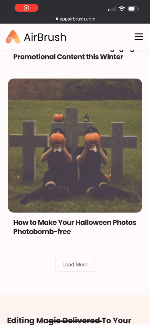
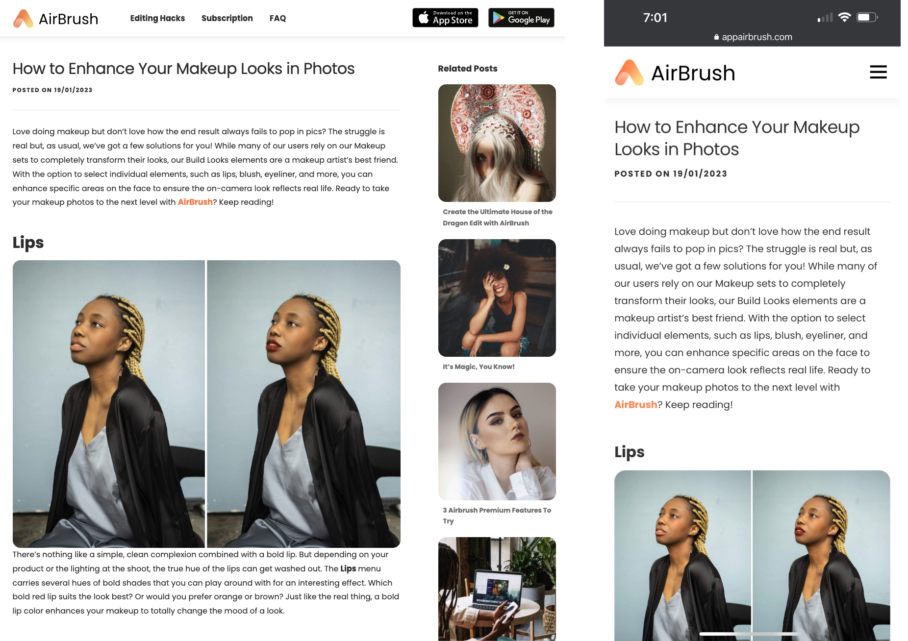
Post Page
Blog page example on a desktop and mobile phone.
Subscription Page
One way to show product value is by listing features and benefits of the app on the website. We are already doing this on the landing page. In addition to it, the team wanted to create a designated page where we highlight our top unique features.
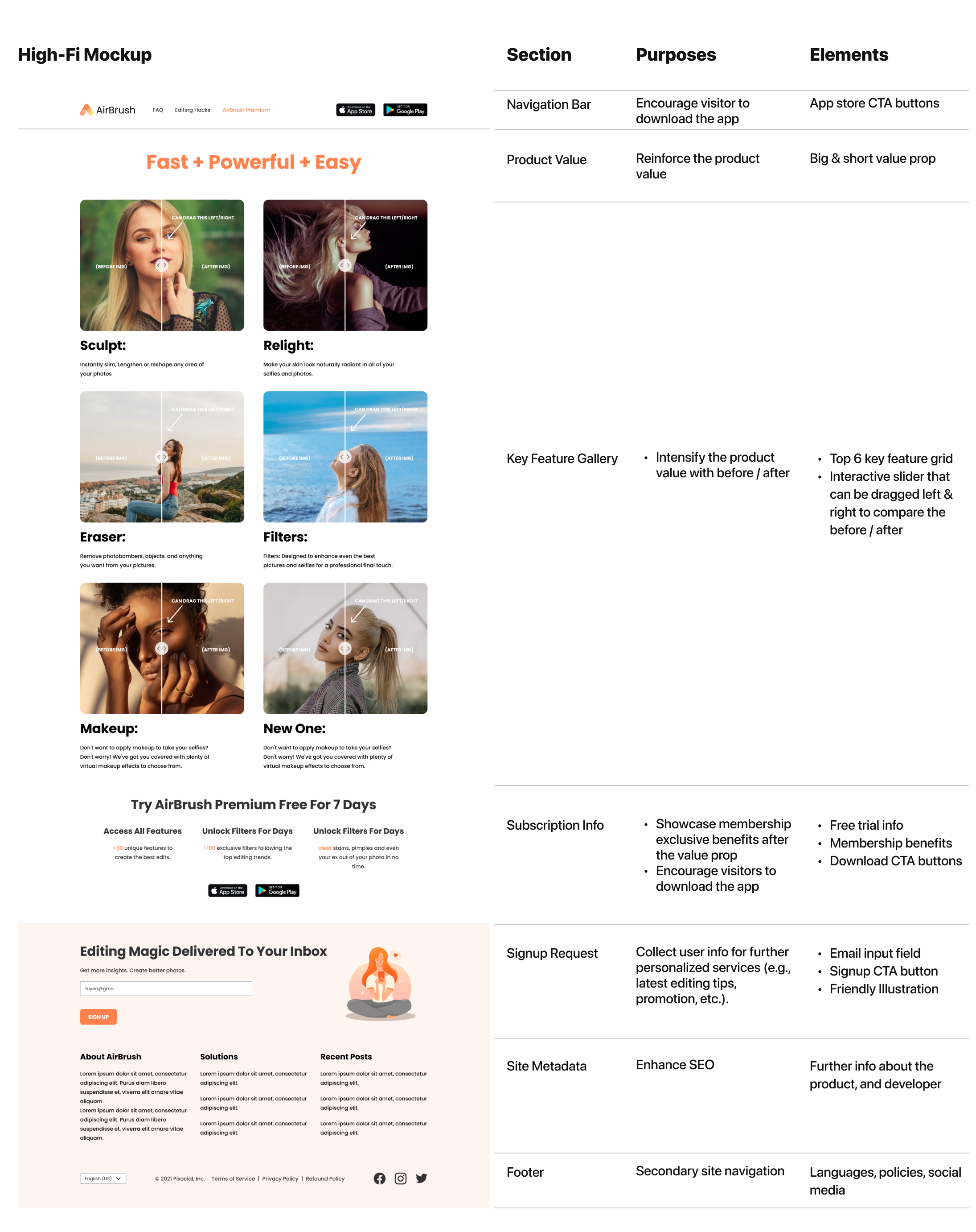
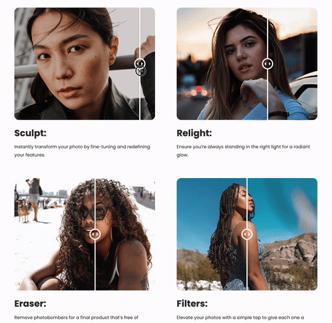
Interactive Before / After Slider
Comparing the before and after results in a photo editor is important because it allows users to see the changes they have made to the image, and to make adjustments as needed. Although due to the scope, we didn’t plane to integrate the real editing function on the website, I designed this interactive slider to show visual feedback that showcase our powerful key features.
Redesign Results
After launching the new website for 3 months, we had a significant growth on site’s Organic Traffics:
📱 Mobile Phone
+260%
🖥 Desktop
+ 55%
What I’ve Learned
It was exciting that I had a chance to lead an end-to-end web redesign project, since I’m more like a mobile app designer throughout my career.
During this journey, I’ve learned lots of new knowledge from my marketing & growth team partners about Search Engine Optimization (SEO), how to build a solid marketing ecosystem via omni channel, like website, app, social media, etc., and as a designer, how to reflect those marketing principles one my actual design work.