Design System- AirBrush
Project Timeline
Jan 2021 - May. 2021
My Role
I defined design principles, created reusable components, and established guidelines for typography, color, illustrations, and other visual elements.
Background
At the beginning of 2021, I led the project to move the design system from Sketch to Figma. This project aimed to improve, and unify the design language across the AirBrush app and provide a consistent UX.
As the AirBrush design team is always small and agile, the team had limited resources to establish a scalable system. The system I inherited on Sketch when I started this position was poorly equipped to handle another growth cycle.
The old Sketch design system I inherited
Goal
As the North American design lead, I am also responsible for expanding the design team. The end goal of this project is to recreated a design system that can be applied as the foundation for our future product development, enabling us to move faster, deliver better products, and offer a seamless photo editing experience for our users.
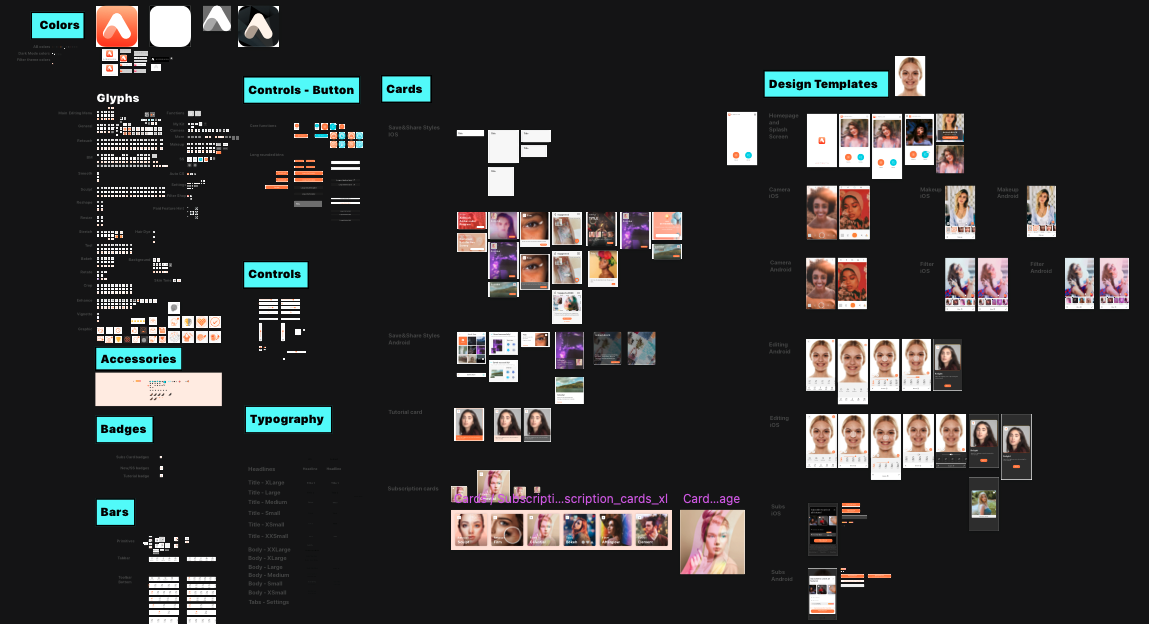
Next, I will share my process and examples of the following topics:
Design Tokens
Colors
Iconography
Illustrations
Components
Patterns
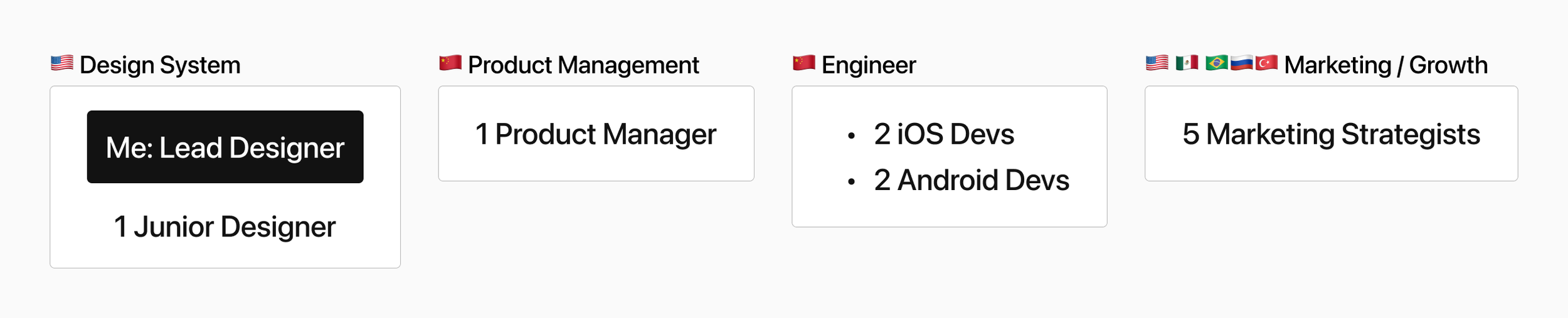
Cross-functional Team Collaborations
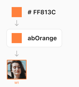
1. Design Tokens
I started with looking for a way to define and standardize app’s core elements that make it easier for designers and engineers to maintain the consistency. I decided to use Design Tokens.
In short, design tokens are nicknames: #2680EB -> cta-background-color
This approach can save valuable time and effort for the development team, allowing them to focus on more important tasks.
For example, in case we decide to modify the background colors of all CTA buttons, engineers will only be required to update the hex value, rather than having to locate all buttons and update them individually, which is a time-consuming process.
The following types of design tokens are the building blocks that make up the new design language:
Global Tokens
Global tokens are represented by context-agnostic names
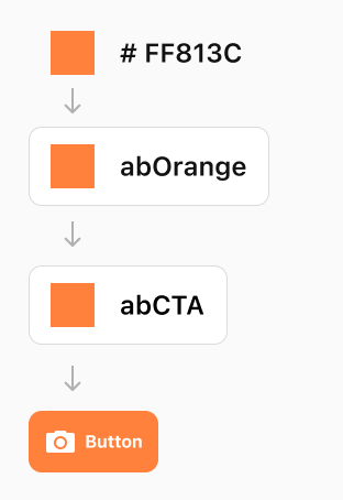
Alias Tokens
Alias tokens relate to a specific context with the intended purpose.
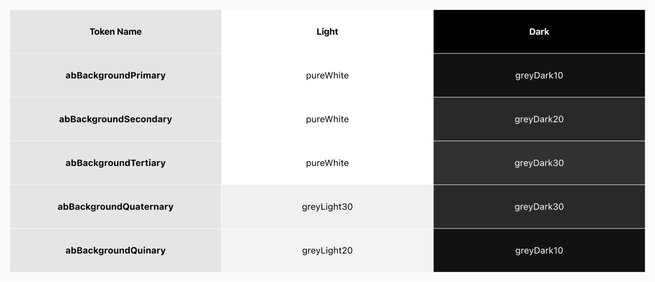
Below is the background color Design tokens include light and dark theme for engineers to implement in a flexible way.
2. Colors
In this session, I’ll explore how to create a balanced and harmonious color theme using an auto-color generator tool O built.
Auditing the Current Color Palette
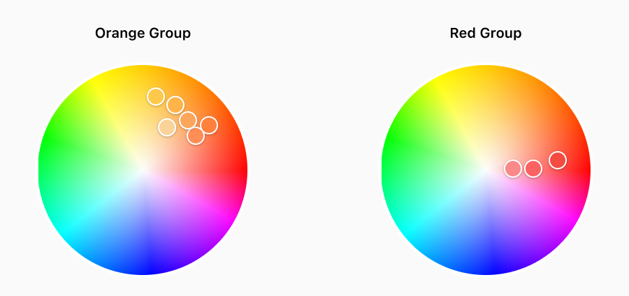
Starting with auditing the current color palette with engineers, I found many previous color attempts with different arbitrary names in the code base, like “orangePrimary”, “orange2”, “lemonYellow”, “blushPink” pointed to similar shades of orange, and red.
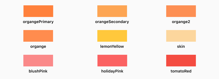
Similar colors with arbitrary names in our code base
In order to make decisions on what colors to keep in the product, I put colors into 2 groups that serve different business purposes, and mapped them on a color wheel to visualize their relationships:
Orange Group: Our branding colors
Red Group: Special promotion theme colors
Ensuring Accessibility
Next, I looked into the accessibility for each color through contrast tests. The goal was to pass the “WCAG AA” standard on the Large Text, and the Graphic Objects categories. Any color that failed would be removed. However, the result was- none of the colors in the orange group pass the contrast test with the white background! To ensure app’s accessibility, I needed to created a new color with a lower lightness to pass the test.
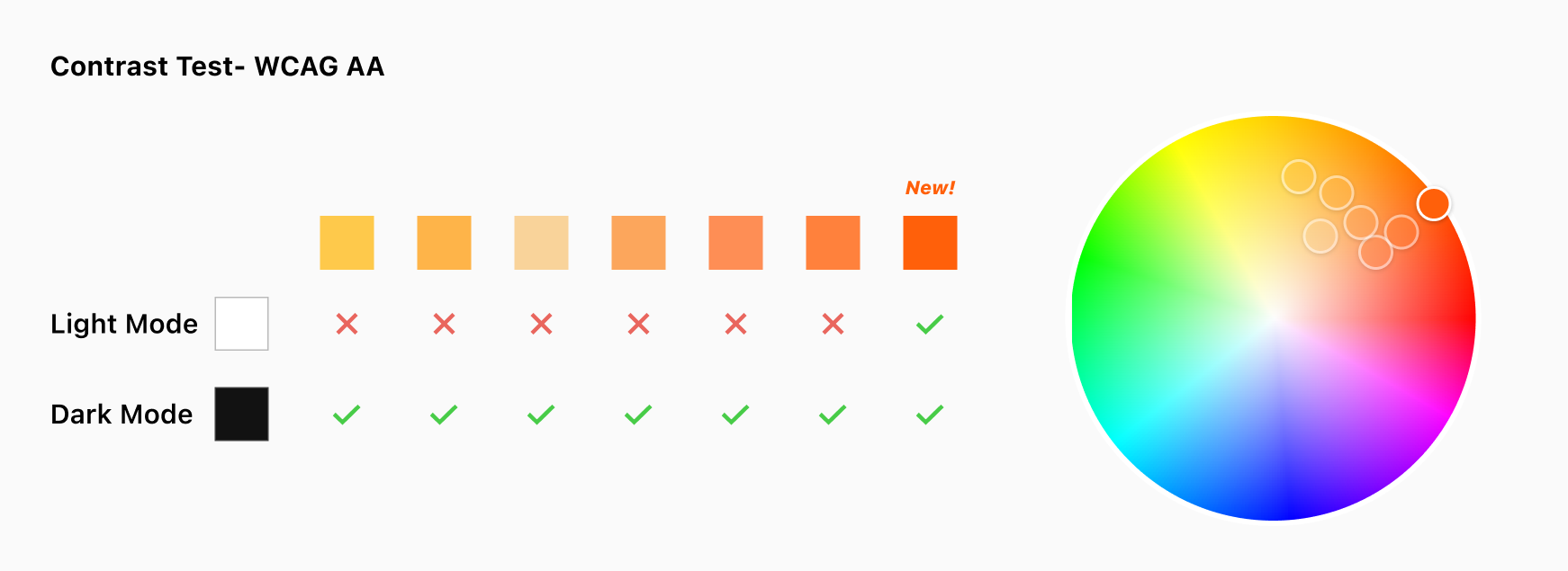
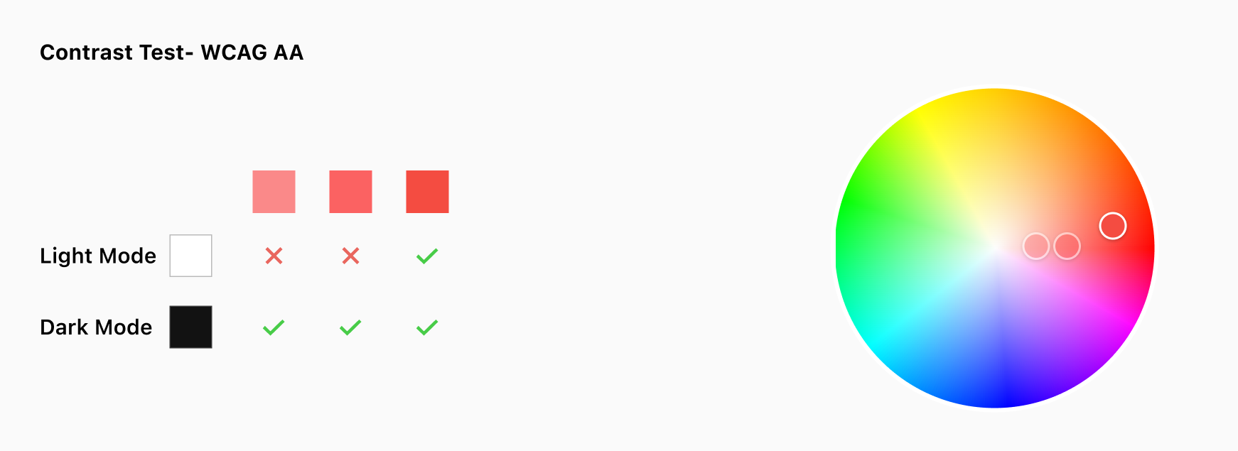
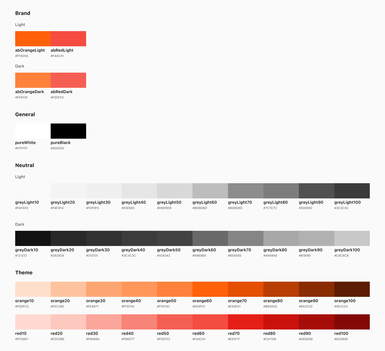
As a result, I had 2 base colors that pass the contrast test. These colors will serve as the foundation for the new color palette, and from here, I will be able to build out a full color theme.
Creating the Theme
With the base colors, I began the process of building out a complete color theme. Starting with defining theme’s function:
A theme made of a sequence of color swatches
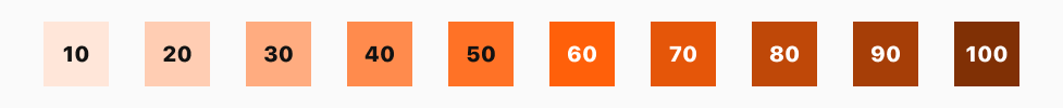
The base color- Theme60
The base color is the dominate tone across the app. I defined that it always should be 60 in light mode, and 50 in dark mode. Both contrast ratios are higher than 3.03 (WCAG AA ready).
Auxiliary colors- Near Theme60
They will be used for visual feedback, like mobile’s pressed state or the hover state for web/desktop based platforms.
Accent colors- Both ends
These colors can be used as the elevated background of a selected item in a popover or a dropdown in both light and dark modes.
Building a Color Generator
Achieving a balanced and harmonious color scale often requires many iterations. To avoid spending excessive amounts of time manually tweaking color values, I created a simple Python environment that allowed me to explore a variety of HSL color settings.
Input: R, G, B value
The code will transform the RGB color into HSL
Set H, S, L values and play around with them.
Output: A color scale with 10 colors
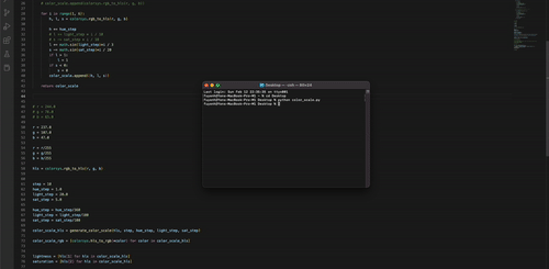
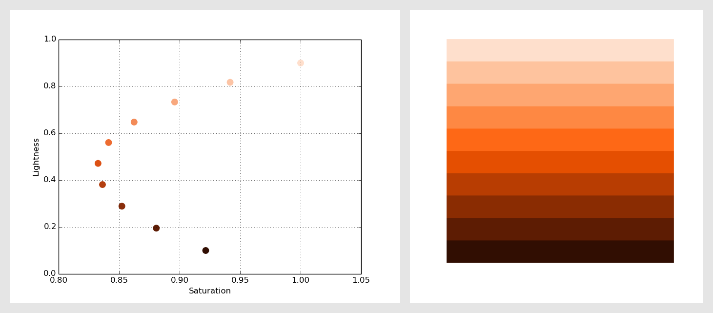
Auto color scale tool visualized by Matplotlib
The reason I chose HSL (Hue, Saturation, Lightness):
We can manipulate colors with saturation and lightness, which separates lightness into its own dimension. Unlike HSB, this can adjust lightness without affecting saturation.
Hue-agnostic Approach
While there is no definitive best practice for choosing colors, it is important to establish some guiding principles. In consideration of the potential expansion of our base colors in the future, I opted for a Hue-agnostic approach. This means that the palette is not tied to any specific hue, allowing it to be applied uniformly across colors of any hue.
I created a diagram with saturation on the x-axis and lightness on the y-axis. By using this diagram, I was able to identify patterns in saturation and lightness levels that could be used to generate a new palette in the future, if needed.
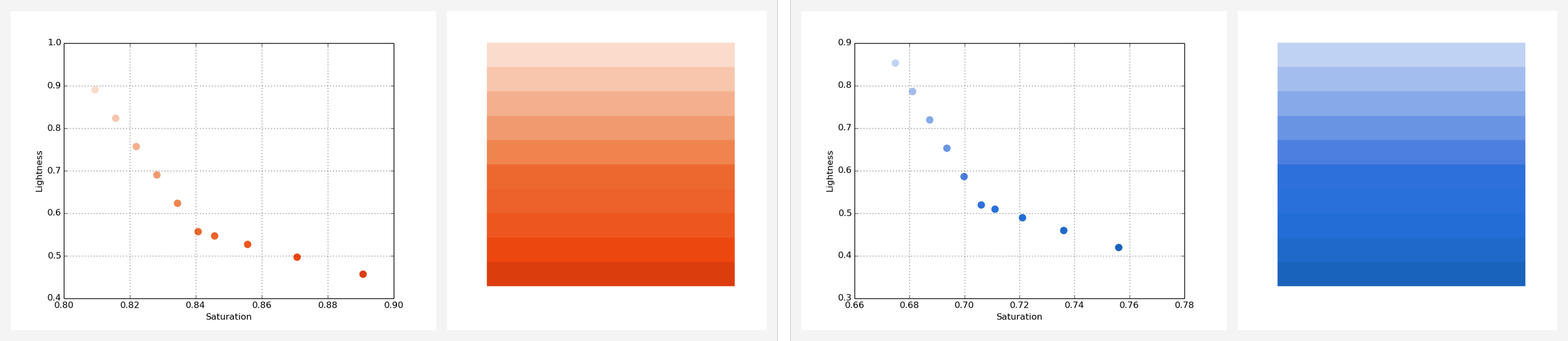
Orange and blue hue share the similar color attribute pattern
Playing Around
I started with playing around the parameters I set, like adding or decreasing saturation or lightness levels. After creating a couple of arbitrary scales, I realized that without a holistic process, it would be impossible to get a smooth color transition.
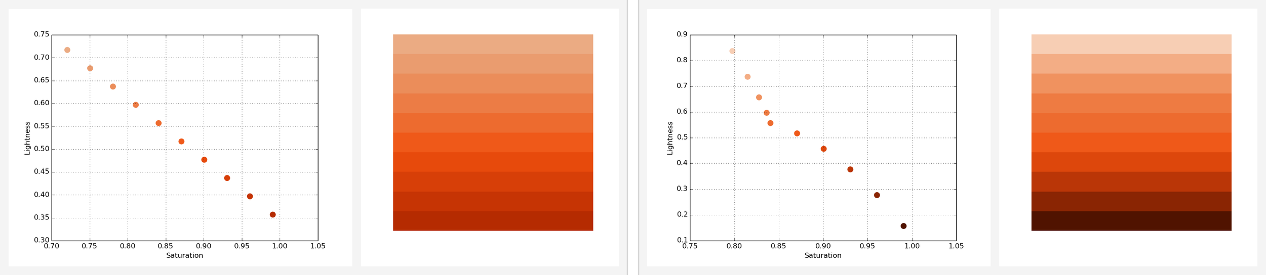
Examples of some early stage color scale
Selecting the Right Curve Type
Through experimentation, I discovered that the scatter pattern was closely tied to the smoothness of the colors being used. Based on this observation, I decided to explore the effect of different curve shapes on the final outcome.
To put this theory to the test, I began by setting the start color to Theme10 and the end color to Theme100, and generated a series of intermediate colors using three different interpolation types.
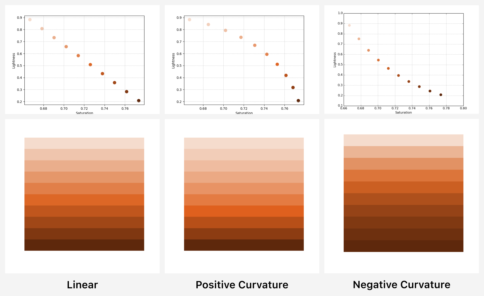
3 curve shapes that reflects lightness and saturation levels
After conducting the experiment, the results were quite interesting. I observed noticeable uneven transitions in both the Linear and Positive Curvature scales, while the Negative Curvature scale produced the smoothest and most dynamic outcome.
Adding the Middle Color
Next, I had to include the Base Color in the scale based on the Negative Curvature color curve. I made adjustments to the script to generate a spline that passed through three key points: the Start Color (Theme10), Middle Color (Theme50), and End Color (Theme100), and interpolated colors in between.
After a few adjustments, I ultimately settled on the outcome shown below due to its smooth transition and dynamic range of colors.
The spline curve made with Scipy
Finally, I applied this rule, and generated the red, and grey scales.
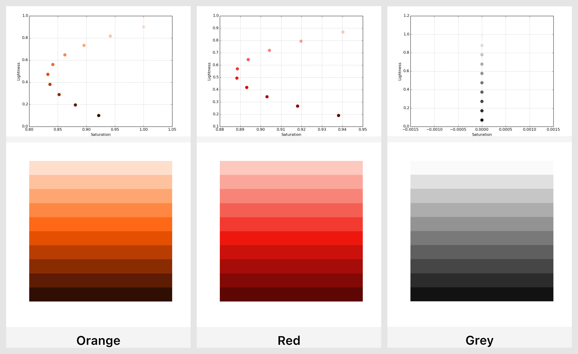
3 color palettes made by the same algorithm
Manually Testing Colors
Although the color generator was a valuable tool in the creation of an effective and visually appealing user interface, it was just one aspect of the overall design process. Ultimately, manual testing of colors was essential to achieving the final look and feel of the interface, particularly with regards to the dark theme.
Results
Before
Previously, the AirBrush color palette lacked any cohesive structure.

After
After implementing a comprehensive design system, the AirBrush color palette is now well-organized and structured.
The structured color palette has also allowed for greater flexibility and customization when designing new features and updates, while maintaining a consistent and recognizable brand identity. Overall, the implementation of a structured color palette has had a significant impact on the success and growth of AirBrush.
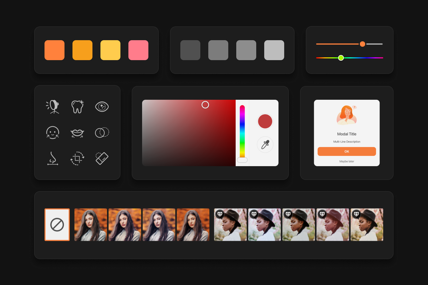
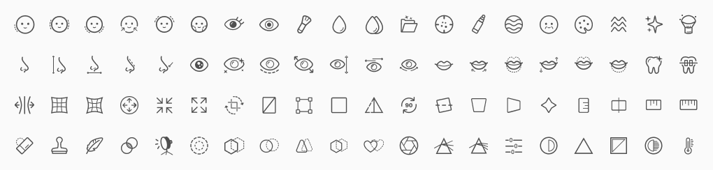
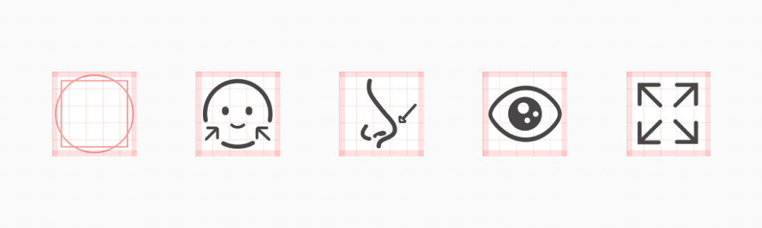
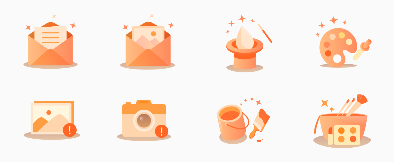
3. Iconography
AirBrush has +80 customized icons that represent a variety of editing tools. One of my key priorities is to ensure that each of these icons adheres to a consistent and recognizable design language.
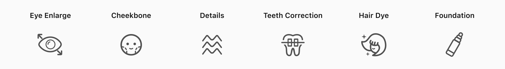
Metaphors
Clear icon metaphor simplifies tool description. By incorporating a consistent and recognizable visual language throughout the product, it’s easier for users to identify and understand the product's unique features.
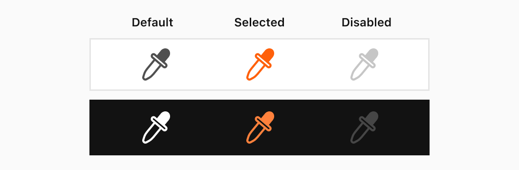
Colors
When it came to designing monochromatic icons, I needed to consider both the interaction state and the color theme of the product. While monochromatic icons provide a clean and minimalist aesthetic, it’s important to vary the color of the icons based on the interaction state in order to provide a clear and intuitive visual cue to the user.
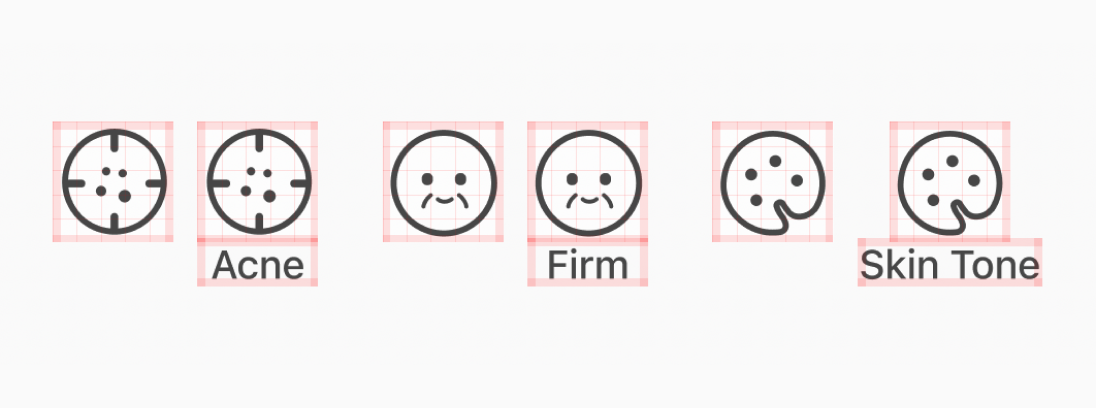
Sizes
Choosing the appropriate size for icons is a critical aspect of creating a visually appealing and user-friendly interface. One approach to determining the ideal size for icons is to ensure that they are proportionate to the size of their corresponding labels
Layout
Add safe area for flexible positioning, and a balance layout. By adding safe areas, designers can ensure that key content is positioned in a way that is both aesthetically pleasing and functional.
Stroke Width
Maintaining consistency in icon stroke width is a critical aspect of creating a visually appealing icon array. For example, at AirBrush, I utilized a stroke width of 1.5px for main objects and 1.0px for additional elements.
4. Illustrations
See the full design process on Medium
Illustrations are primarily used in AirBrush app to enhance the information presented in modals, creating a more engaging and visually appealing experience for users.
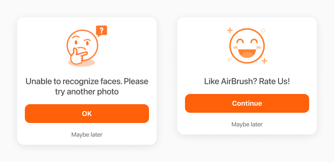
However, I noticed that the illustrations throughout the app were not effectively fulfilling their intended purpose. The emoji illustration style seemed a little off to me. It didn’t quite capture the emotions that we were aiming for.
Our Goal: Capturing Emotions
By using illustration to capture these emotions, we were able to create a more engaging and relatable experience for our users. Whether it’s the feeling of joy and excitement when having a satisfactory editing result, or the frustration and disappointment when a feature doesn’t work out the way we hoped, emotions are an integral part of our photo editing journeys.
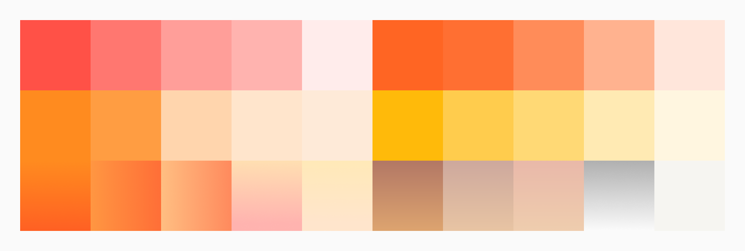
Illustration Palette
Developing an illustration palette that is based on the main brand colors is a fundamental aspect of creating a visually consistent illustrations. This process involves selecting a primary color or color scheme that aligns with the brand color and then complementing these colors with additional hues, highlights, shadows, and other colors to meet a variety of lighting needs.
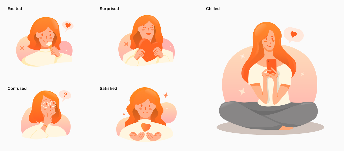
Girl Theme
To cater to the main user demographic of young girls, my junior designer and I had developed a unique illustration set that incorporated both a girl theme to capture a range of emotions. These illustrations could help to create a more personalized and relatable experience for the user.
Object Theme
Building upon the foundation of girl illustrations, we created a set of object illustrations specifically designed for use in system notifications or feature updates. These illustrations were carefully crafted to align with the overall aesthetic of the product.
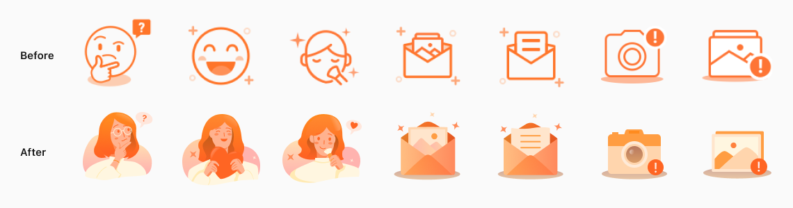
Before & After
By putting the old and new illustration sets side by side, it's clear that the new one is way more eye-catching and interesting.
Result
The illustration project was a success with positive feedback from both stakeholders and users. The new illustrations not only added a fun and playful element to the app, but also made it easier for users to navigate and understand different features.
“I gotta say, these illustrations are pretty sweet! They make the app feel a lot more fun.”
When it came to the design process, the new set of illustrations helped a lot in terms of getting our message across and making the app more engaging.
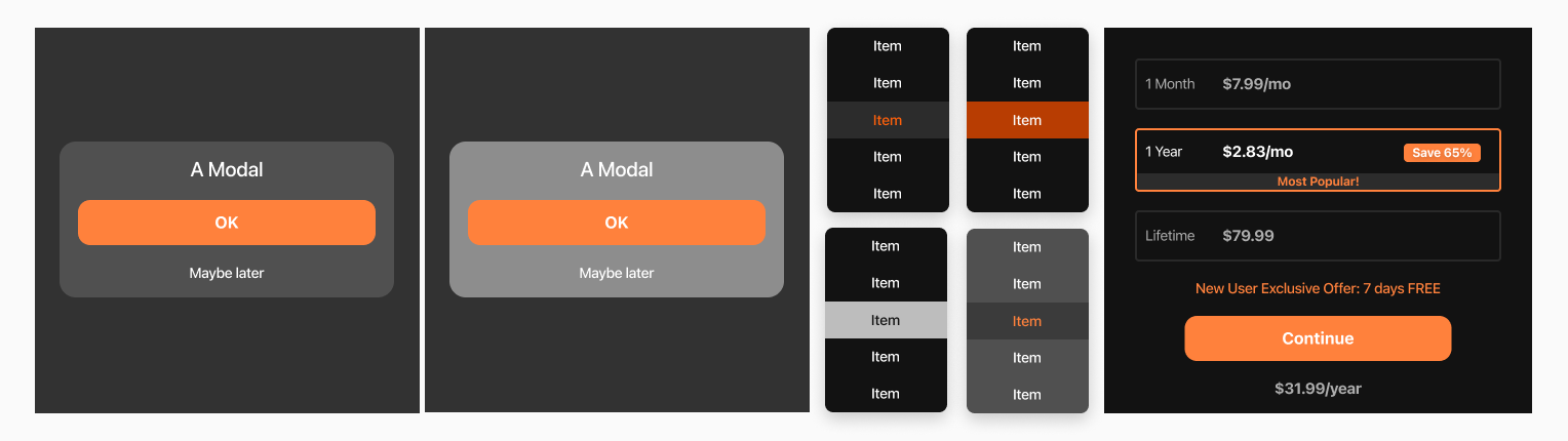
5. Components
Some examples of photo editing centered UI components I created, include a variety of tools and features that are tailored to the unique needs and preferences of photo editors.
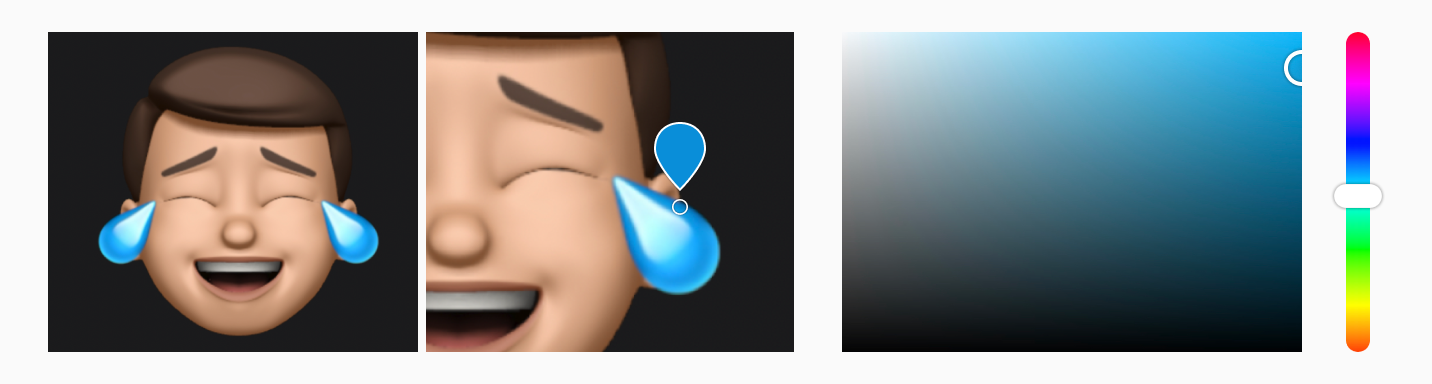
Color Picker
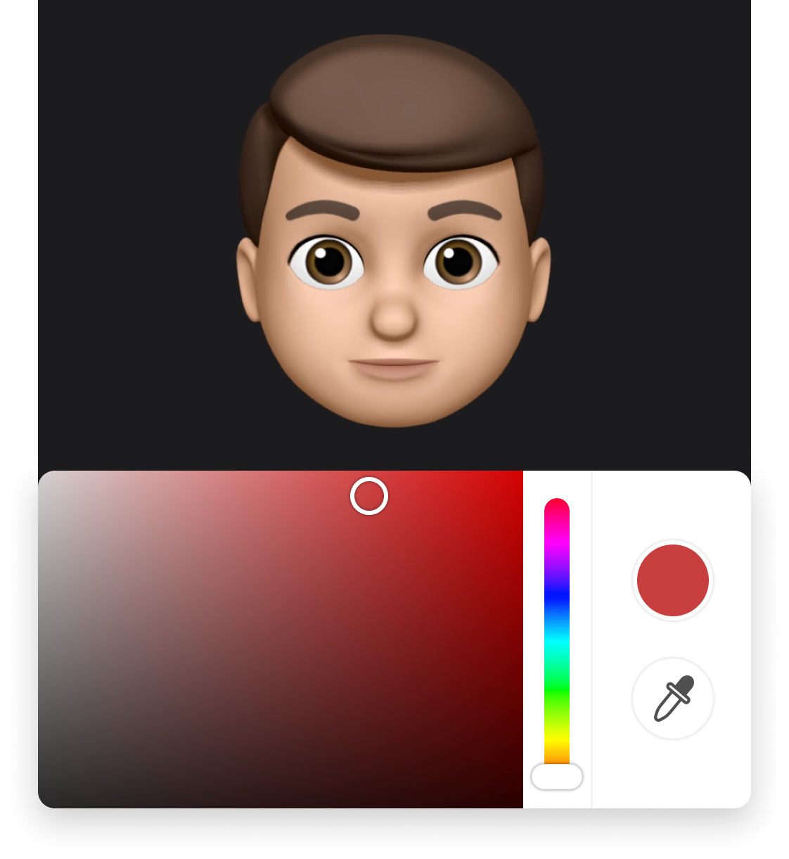
Picking a Color
A color picker allows users to visually select a color through 2 color properties or an eye dropper tool.
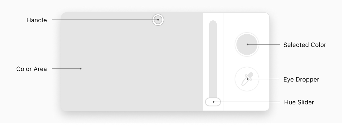
The color picker UI component includes an eye dropper tool, which enables users to select any color present in an image. The chosen color will be updated in both the color area and the hue slider. Additionally, to facilitate more precise color selection, users have the option to zoom in on the photo.
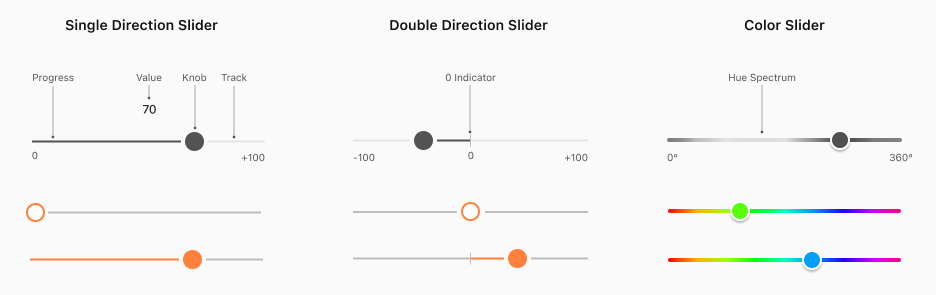
Sliders
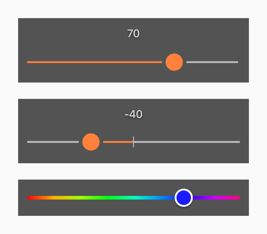
Selecting a Value
Users can utilize sliders to swiftly choose an intensity, size, or color value within a given range.
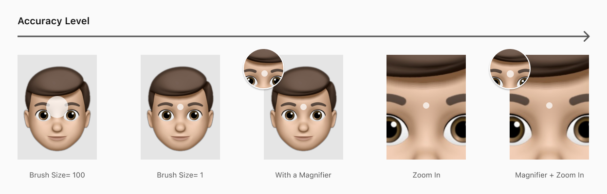
Brushes
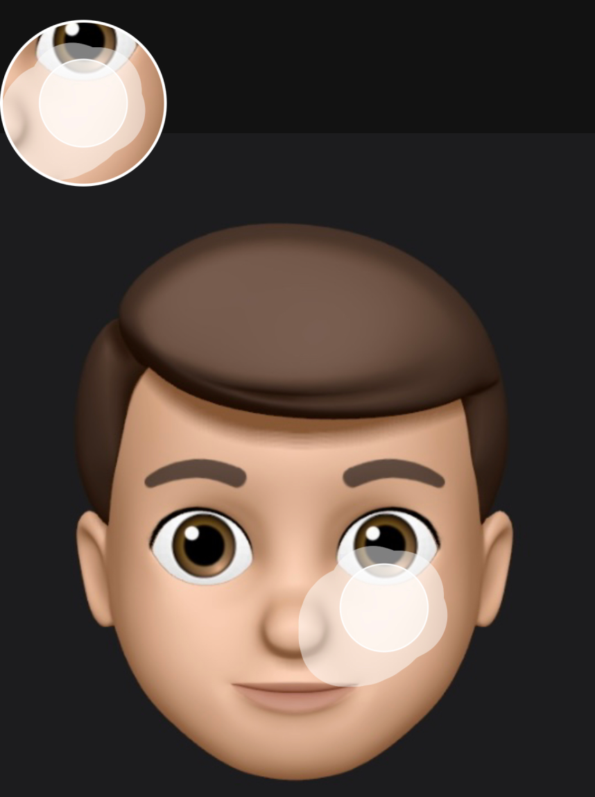
Adjusting Accuracy
By utilizing the brush sizing, magnifier, and zoom in features, users can achieve varying levels of accuracy and precision
For example, when working on fine details or intricate areas, users may opt to use a smaller brush size, along with the magnifier and zoom in features, to achieve a highly precise result.
By offering these versatile and customizable features, the editing UI component system can help users achieve the desired level of accuracy and precision for any given editing task.
6. Patterns
Modals
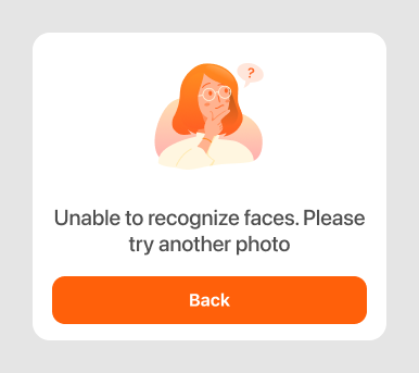
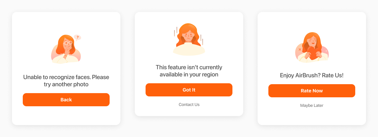
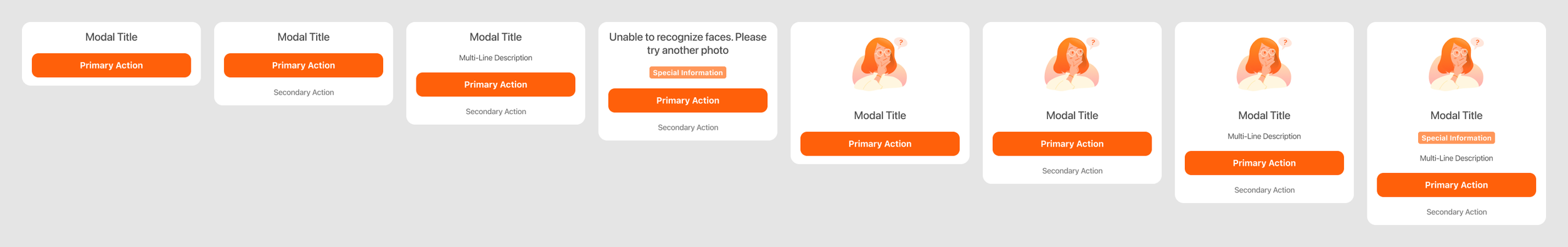
Addressing Information
Modal group was designed to let users to browse a collection of information and actions.
I designed a customizable option set for modals that displays various visual elements based on the specific needs of each task. This level of customization could help streamline the workflow and enhance the overall usability of the product.
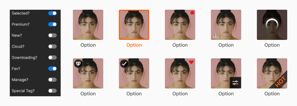
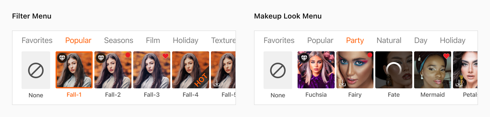
Asset Menu
The asset menu, which includes filter and makeup looks options, must be designed with consideration of all possible scenarios and asset states to establish effective menu patterns.
Cross-functional Team Collaborations
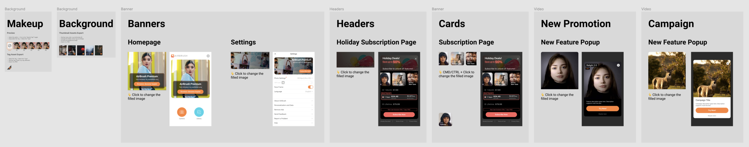
I also built a marketing template for marketing partners allows for greater flexibility and collaboration when creating campaign materials. By providing a range of real UI options within the template, marketing partners can explore different design concepts and styles that are tailored to the specific needs of their campaign.
Impact
Design
Junior designers are able to design new features more quickly using provided patterns
Creates more comprehensive work by utilizing all available component variants
Enhances the overall design process and improves collaboration between teams
Engineer
Building a comprehensive design system has streamlined the development process
Engineers can now refactor the codebase according to the established system
Eliminates the need to ask for small design details like color palettes or pop-up styles
Company
The success of the design system has led to the development of new video apps
Company now structures new product strategies based on the success of the design system and AirBrush